HND 2: Final Major Project

HND 2 Graphic Design

Proposal

Introduction The British library is holding an exhibition based on the book ‘How to cure the plague and other curious remedies’ by Julian Walker and published by The British Library. This book presents a fascinating illustrated compilation of some of the most curious and disturbing cures from history, from the Middle Ages to the 19th century.   Objective To effectively create a range of graphics that advertise and present the exhibition, the designs will consist of but not be limited to;

·      Posters advertising the exhibition

·      Banners (for buildings)

·      Exhibition Program

·      Exhibition graphics

 British-library-research-and-prep

poster-comparison

V&A-BlogExhibition & Evironment: Bibliothèque

http://www.bibliothequedesign.com/projects/exhibition-and-environment/

A design company Biliothèque has extensive experience in environmental design, from the V&A, Natural History Museum, Science Museum to The British Library.

linocutsblogfirstlinocut


Screen Shot 2015-03-19 at 10.31.25

Using the book as a guide for my images, I decided to focus on the ingredients of the recipes, one involved the sap from the Dragon blood tree, this I drew as a linocut.

Dragon-blood-lino-cut

http://discovermagazine.com/galleries/2014/march/how-to-cure-the-plague

illustrated-initialshanddrawntypepick-me-up-blog

pestle-and-mortar

pestle-and-mortar

leaves

FONT

Recentpickmeup

Toads-to-tinctures-development-T


Crit-Feedback2

experimenting

experiment-white


Large-text

colour-picking

Trio-of-posters

posters

PEer-review

Mouse-linocut

The-golden-ratio-research

http://www.hongkiat.com/blog/golden-ratio-in-moden-designs/

The-Golden-Ratio-2 Following-a-rule

Border

Different-Designs

Yellow-in-poster

The-quote

Small-changes-compositionDSC00966

Type-sizeticketpostcard

Bag-and-mugst-chris-bus_stop-poster-saint copy

Evaluation

My over all aim was to design a range of graphics to present and advertise the exhibition. The poster to advertise had to be eye-catching and memorable. I wanted to go against the grain and create something different to the British Library’s standard graphics. I feel that the end result if an effective poster that immediately attracts attention. I utilised my existing linocuts on postcards, tote bags and mugs, the tickets I made had a modern feel to them and are printed on high quality paper.

The finish is professional and the pieces connect with each other – I am pleased with the result.


Design Factory

The Brief
  • This project is all about user-centric design thinking. You are invited todesign an intervention that will make the intended user feel something strongly about themselves. Your task is to develop something with which an individual can engage and then say “I feel… *something*” (e.g. “I feel invincible”, “I feel small”, “I feel in-tune with my environment”, “I feel weightless”, “I feel rebellious”, “I feel contented”).
    The resulting intervention or outcome could take any form. For example, you could design:
  • an inhabitable space,
  • a piece of graphic communication,
  • an item of clothing or
  • an interactive system/ piece of technology.
My Proposal
To design a children’s song book based on the French song ‘Alouette’.  The song first published in 1879 is about a Lark’s feathers being plucked from different parts of its body. Today, the song is used to teach French and English speaking children in Canada and other English speakers learning French around the world the names of body parts. Singers will point to or touch the part of their body that corresponds to the word being sung in the song.
The song used as a great learning tool is memorable due to its grotesque translation into English, my aim is to illustrate the song in a way that doesn’t appear evil or grotesque making it more suitable to children.
I will begin by researching the origins of the song (French and Canada) as I hope to include some elements from these countries, then I will decided on an illustration style and colour palette for the book and begin to create the illustrations.
The song Alouette does not have much visual media attached to it besides a few videos on youtube, so I had a blank slate to start my research. Thinking back to the brief I needed to create a book that the used would become emotionally involved with
 What makes a great picture book?
I’ve been looking into what makes a good children’s book in terms of illustration – below are a selection of the best children’s books of 2014. Hand-drawing seems to be a good place to start and also having a strong main character who appeals to readers

Screen Shot 2015-01-29 at 19.24.44

Because I am illustrating for a song that is already written my main focus are the visuals, the key topics I need to think about when creating my illustrations are.
To design a character that the reader connects to with illustrations that are authentic, captivating and exciting.
Illustrate a story/journey while following the song
To aid the learning experience with images.

Screen Shot 2015-01-22 at 17.12.51Development

________________________________________________________________________________________

Screen Shot 2015-01-29 at 21.12.28Screen Shot 2015-01-29 at 21.12.36

Screen Shot 2015-01-29 at 21.12.57

Developing an Illustration style

Screen Shot 2015-01-29 at 21.57.42 Screen Shot 2015-01-29 at 21.57.54

Screen Shot 2015-01-29 at 21.58.24 Screen Shot 2015-01-29 at 21.58.32

Screen Shot 2015-01-30 at 10.17.48Screen Shot 2015-01-30 at 11.19.25Screen Shot 2015-01-30 at 11.18.50

Screen Shot 2015-01-30 at 11.17.01

Design Factory Proposal

To design a children’s song book based on the French song ‘Alouette’. The song first published in 1879 is about a Lark’s feathers being plucked from different parts of its body. Today, the song is used to teach French and English speaking children in Canada and other English speakers learning French around the world the names of body parts. Singers will point to or touch the part of their body that corresponds to the word being sung in the song.

The song used as a great learning tool is memorable due to its grotesque translation into English, my aim is to illustrate the song in a way that doesn’t appear evil or grotesque making it more suitable to children.

I will begin by researching the origins of the song (French and Canada) as I hope to include some elements from these countries, then I will decided on an illustration style and colour palette for the book and begin to create the illustrations. I will use a combination of hand drawn illustration and computer art.


Branding Brief

Screen Shot 2014-11-03 at 11.54.26

You are to develop the branding of a given celebrity. The aim of the project is to design a branding that will project a positive image of the given person. It is important that you create your branding in a way that you believe the celebrity would wish to be portrayed rather than how you feel about them.

You must research around the topic of branding and personal promotion with a view to demonstrating the key concepts regarding branding.

Typography must, of course, be well considered throughout.

Deliverables

You are to produce a logo, letterhead, business card and compliment slip. These items are to be of standard size. You will also produce a style guide for your client and this will include instructions as to how the logo, typeface(s) and colour systems are to be used. We would also like you to consider the making or visualising of a promotional item. Again, you will need to research these.

What is Branding?


The Secret Power of Brands course by the University of East Anglia taught me that a brand is not just a logo, below is a generic definition for a brand.Screen Shot 2014-11-03 at 12.37.58

They believe that it goes deeper than that, a brand is not just a name, logo or slogan and brand is what a company stands for and also what causes is to stand out.Screen Shot 2014-11-03 at 12.38.10Brands are powerful because they stay in our minds, below are a few brands and what the public say they stand for.

Screen Shot 2014-11-03 at 12.48.09 Screen Shot 2014-11-03 at 12.48.19 Screen Shot 2014-11-03 at 12.48.27 Screen Shot 2014-11-03 at 12.48.37

Their summary is that branding is made up of different components, below is their three part definition.

“Another important aspect of brands is that they are not just a one way, they work both ways between the consumers (thats us) and they brand. The brand transmits to us their branding the consumers then interpret this back to the brand. Therefore what a brand stands are is what we interpret it to be”

Companies are not just telling us what to think it is the social interpretation of meaning.Screen Shot 2014-11-03 at 12.49.06


What makes a good brand?

Continuing with the University of East Anglia’s course ‘the Secret Power of Branding’ I research what makes a good / successful brand.

The information originally came from Wolff Olins Blog. http://blog.wolffolins.com/post/44609883279/brand-is-the-effect-of-what-you-do-not-the-cause

Abolish positioning. Think purpose.

Don’t try to manufacture a place in the world. Don’t obsess about the competition and differentiating from them. Instead, as with all good design, start with the question ‘why?’. Why do we exist? Why would anybody need us? Why is what we do useful? Why would people pay (in time or money or whatever) for it? Why is it valuable (in all the senses of that word)? In other words, define a sense of purpose – the difference you want to make, socially and commercially.

Forget identity. Think experience.

Don’t start with name, logo, tagline, sonic identity, or any of these things. Instead, design whole experiences for people – joined-up experiences across all the things you do. ­­Think user interface, in the biggest sense: not the skin around the outside of your organization, but the layer where you interplay with people. 

Stop controlling. Think changing.

Don’t try to maintain a status quo, don’t police your brand. Instead, keep experimenting, keep connecting up with new people and new organizations. Let things grow from the roots: revolutions rarely start from the top. Don’t try to pin down the future: prototype it. Replace ownership with sharing, and control with creativity. Look at brands like Airbnb and Zopa, the world’s first peer-to-peer money lending service, to consider how you can connect your customers directly to each other and have them create mutual value. Tomorrow’s high-growth businesses will be constantly experimental and completely boundaryless. 

What Makes a good logo?

Screen Shot 2014-11-12 at 10.58.35

Why the Pecten?

“The company name was “Shell” and each of Samuel’s tankers carrying kerosene to the Far East was named after a different seashell. The Pecten may have been taken from the family coat of arms of a business associate, Mr Graham, who imported Samuel’s kerosene into India and became a director of The Shell Transport and Trading Company.”

Screen Shot 2014-11-12 at 11.00.21

Why Red and Yellow?

“In 1915 the Shell Company of California first built service stations and had to make these stand out from the competition. They used bright colours that would not offend the Californians: because of the state’s strong Spanish connections they chose red and yellow.”

Why I think this is a good logo?


Screen Shot 2014-11-12 at 11.02.51

The current logo created in 1971 by Raymond Loewy has become so recognisable that if often appears without the brand name (similar to nikes swoosh or Mc Donald’s golden arches) this gives the logo more potential when being used as it is flexible. The Bold colours and lack of text mean it is easily spotted when driving at fast speeds!


Stephen Fry Profile


Screen Shot 2014-11-12 at 11.49.49

“Stephen Fry is an actor, writer, director and television presenter known for his performances in A BIT OF FRY AND LAURIE, JEEVES AND WOOSTER (both with Hugh Laurie) and BLACKADDER. His numerous film appearances have included award-winning performances in PETER’S FRIENDS, WILDE, GOSFORD PARK, V FOR VENDETTA and EICHMANN. He has recently starred as Mycroft Holmes, elder brother to Sherlock, in Guy Ritchie’s sequel and will appear as Master of Laketown in Peter Jackson’s  THE HOBBIT.  Stephen wrote and directed BRIGHT YOUNG THINGS in 2003.
He currently hosts the BBC quiz show QI and stars in the guest role of Dr Gordon Wyatt in the Fox series BONES; and previously he starred in three series of KINGDOM for ITV.   As a presenter his documentaries include THE SECRET LIFE OF THE MANIC DEPRESSIVE, STEPHEN FRY IN AMERICA, LAST CHANCE TO SEE and most recently FRY’S PLANET WORD, all for the BBC He has written four best-selling novels, two volumes of his autobiography MOAB IS MY WASHPOT and, most recently,
THE FRY CHRONICLES.”

Name: Stephen John Fry

Birthday: 24 August 1957 ( Age 57)

Known as: English comedian, actor, writer, presenter, and activist.

Trade marks: 

His tall stature
Often works with Hugh Laurie
Crooked nose
His sonorous voice and received pronunciation
Witty Quotes
Sexuality: Gay
“I suppose it all began when I came out of the womb. I looked back up at my mother and thought to myself, ‘That’s the last time I’m going up one of those'”

Childhood: Fry was born in Hampstead, London, on 24 August 1957, the son of Marianne Eve Fry (née Newman) and Alan John Fry, an English physicist and inventor. After a troubled childhood and adolescence, during which he was expelled from two schools and spent three months in prison for credit card fraud, he secured a place at Queens’ College, Cambridge, where he studied English literature.

Religion: Fry has expressed an opposition to organised religion and has identified himself as an atheist and humanist.

Trivia:

http://www.imdb.com/name/nm0000410/bio?ref_=nm_ov_bio_sm

A few facts about Fry from the above website:

Macintosh fanatic, Usenet lurker, Internet/WWW enthusiast.

He’s regarded in the UK as ‘Britain’s Favourite Teddy Bear’ and is a keen teddy bear collector himself.

Smoked a pipe.

With Nick Green, co-founded the Bear Rescue Foundation, a charitable trust to rescue and nurture distressed bears.

Flies his own classic biplane.

Very fond of vintage British TV themes.

His very recognisable crooked nose is a result of breaking it when he fell over in the school playground at the age of six.

Business:

Co owns sprot pictures with Gina Carter http://sproutpictures.com

Current Branding:

Books

Screen shot 2014-11-17 at 11.33.47


WebsitesScreen shot 2014-11-17 at 11.35.20

Screen shot 2014-11-17 at 11.37.19

Live Tours

Talent house hosted a competition to design a poster for ‘Stephen Fry: Live’ view the submissions in the link below!

https://www.talenthouse.com/i/design-a-poster-for-stephen-fry/submissions


Signature:

767px-Stephen_Fry_signature.svg

Business Card Comparison

I browsed through a selection of business card that I have at home. Some of my favourites are pictures below.

I like the front of the rindwash business card, it promotes interest by asking a questions, I feel it looses consistency on the back as the font changed and the spacing between the type and images is a little off.
Screen shot 2014-11-25 at 12.02.48 Screen shot 2014-11-25 at 12.02.59 Screen shot 2014-11-25 at 12.03.42 Screen shot 2014-11-25 at 12.04.19 Screen shot 2014-11-25 at 12.04.54

Initial Ideas

I began by drawing small images using a black ink pen with the idea to place them on the business cards – each drawing resembles something to do with Stephen Fry.

IMG_1329I scanned the drawing into my computer and opened them in illustrator once there I converted them to one colour logos.

Screen Shot 2014-12-08 at 15.53.19


I found that the drawings didn’t convert very well with any of the live trace effects so I took my favourite and traced it to make a vector illustration, this allowed me to alter the colours and size of the image more easily. I then applied the vector to a mock business card – I didn’t like the outcome as I thought it looked childish and irrelevant to Stephen Fry. So I went back to the drawing board…

Screen shot 2014-11-28 at 11.57.38

I wanted to narrow my symbols down to three – I thought about his job, characteristics and look – three symbols came to mind one was a book, the second was a teacup to show his  posh / English side and the third was a pair of round glasses that he wore but also to signify intelligence.

Below is my first draft, however after feedback – I came to realise that the glasses look like Harry Potter and that perhaps I do have too many symbols.

Screen Shot 2014-12-08 at 16.03.24


I decided to stick with the teacup but drew another..

Screen Shot 2014-12-08 at 15.05.13 Screen Shot 2014-12-08 at 15.05.25

IMG_1353

Screen Shot 2014-12-10 at 11.54.10

IMG_1376


Conclusion

Screen Shot 2014-12-13 at 11.28.36

I am pleased with the final piece, the colour scheme chosen looks formal and imitates Stephens dress sense (browns, beige and blues) the colours compliment each other and could be used in a wide variety of media (books, CD’s T shirts). I am happy with the font (copperplate) as I wanted one that worked across the whole media pack copperplate does this by not appearing to feminine in the addresses and titles but also working well as the initials on the teacup. The Teacup adds a sense of humour and cheese picking up for Fry’s humorous side.

If I could change a couple of things it would be to pay more attention to the layout on the compliment slip and letterhead and also to reduce the borderline thickness or remove it altogether.


Unusual Words Brief

IMG_5835

A book by the title of ‘Unusual Words’ is about to be launched by the publisher Octopus Publishing Group

You are to produce two posters that promote the book’s launch. You are to include image and type in any way that you feel is suitable. Each poster must contain at least one ‘unusual’ word and its dictionary definition. Your image and typeface choice should emphasise the meaning or mood of the word.

The posters are to be scalable to any A size. No smaller than A3 for submission. You may explore as many styles of illustration as you wish, but the two final pieces must be of a consistent style.

You will choose your own copy.

Please include Octopus Publishing’s logo somewhere on your posters along with the launch date of November 1st 2014.

As ever, your journals and blogs must fully address the learning outcomes. It is your responsibility to familiarise yourself with them.

Photography:

Subject specific:

(1) Developed an understanding of different historical approaches to photography and the historical and cultural debates relevant to the medium.

(2) Explored concepts within visual culture in general and related these concepts to photography and examined a range of photographic genres.

(3) Developed a knowledge of technological developments in photography.

(4) Created practical work relating to various concepts and genres of photography.

(5) Developed their skills of visual, written and oral communication.

Generic:

(1) Gained knowledge by carrying out relevant research.

(2) Created practical work of a high professional standard using a range of photographic equipment, techniques and materials.

(3) Taken part in discussion and expressed opinions upon and analysis of a range of topics.

(4) Evaluated their own work and the work of others in relation to concepts in photography.

My Unusual Words

I was looking for a word that could be visualised and illustrated in an interesting but not overly complicated way as I am not the best at drawing.

My first choices are below –

Pogonotrophy –

The act of cultivating, or growing and grooming, a mustachebeardsideburns or other facial hair.

Cancatervate

 Heaping things into a pile

Defenestrate –

To throw (a person or thing) out of a window.

Bibloclasm –

person who mutilates or destroys books.

Eleutheromania –

A mania or frantic zeal for freedom.

Yonderly –

Absent Minded

Mundivagant –

Wandering over hills or mountains

To help narrow down my choices I picked the most promising and did a 5 minute quick thinking task for each where I wrote down as many things to do with the unusual word as possible!

IMG_7084 IMG_7085 IMG_7086 IMG_7087 IMG_7088


Illustration Research – The Project Twins

As I was surfing the internet for my unusual words I came across a Graphic Art Studio called The Project Twins one of their personal projects was to illustrate unusual words.

“Bold graphics and visual wit are used to interpret and represent a collection of strange, unusual and lost words. These images explore the meaning behind the words, which are sometimes even more strange or unusual.This series of work has been exhibited during Design Week Dublin 2011 and has been featured and reviewed on various blogs and magazines including Brainpickings, The Huffington Post and Design Taxi.”

Here are some examples of their art!


Screen Shot 2014-10-03 at 15.44.52 Screen Shot 2014-10-03 at 15.44.42 Screen Shot 2014-10-03 at 15.43.35 Screen Shot 2014-10-03 at 15.43.06 Screen Shot 2014-10-03 at 15.41.54 Screen Shot 2014-10-03 at 15.41.36


Texture Tutorial


To help me add dimensions to my vector images I followed a tutorial on how to use grids, gradients and textures to add depth to illustrations.

1# Set up a grid
1# Set up a grid
Screen shot 2014-10-17 at 20.10.23
2# Rough out an illustration

Screen shot 2014-10-20 at 11.58.20

#3 Choose a colour palette, for this I chose something organic from the swatch library
Screen shot 2014-10-20 at 19.32.53
Screen shot 2014-10-20 at 19.47.44 #4 Add texture to shapes by adding a brush texture to the edges to give the shapes a hand drawn feel.
Screen shot 2014-10-20 at 20.31.12
5# I added a slight gradient to some of the shapes and a halftone pattern


Screen shot 2014-10-23 at 09.31.27

My initial idea was to use the for my unusual work ‘Yonderly’ which means absent minded how ever I remembered another word I came across ‘Montivigant’ meaning wandering over hills or mountains which I thought more appropriate, my next step was to create a person wandering over my textured illustration!

Finishing Touches

‘You are to include image and type in any way that you feel is suitable. Each poster must contain at least one ‘unusual’ word and its dictionary definition. Your image and typeface choice should emphasise the meaning or mood of the word.

Please include Octopus Publishing’s logo somewhere on your posters along with the launch date of November 1st 2014.’

Screen shot 2014-11-02 at 20.43.03

For the type I chose the font helvetica neue, I used Bold for the heading ‘The Book of Unusual Words’, regular for ‘November 1st 2014’ and Light for the words meaning, I first created the type on the montivagant posted then copied it onto pogonotrophy.

Screen shot 2014-11-02 at 21.00.27

IMG_8242

Since these versions I have altered the type after feedback from my tutors.

I kept Helvetica Neue but changed some of the weights, the heading is lighter and the unusual word definition is at the top of the page I have also increased the spacing between words.

Montivagant new type

Berlin

I recently visited berlin and decided to do an article for creative review about the city! All the pictures use are my own and I gained research just be being there…

In Berlin every corner you turned there was street at some big that covered wholes buildings and some the size of your hand dotted around on objects, I wanted a big focus to be on the street art so I Included this image from the Berlin wall, I then created the word BERLIN to match the colour from the image.

Screen Shot 2014-09-19 at 13.42.45

Screen Shot 2014-09-19 at 13.45.10

For the main body of text I used information from leaflets I collected while in Berlin and also the internet to comprise the writing.

Berlin is a very cultural city with a lot of history and museums, I would have like to visit more museums while I was there but we only went to one which was the Jewish museum, this was very contemporary and focused greatly on the design of the museum for this reason I think it merited being in my article.

Screen Shot 2014-09-19 at 13.47.55

Another great part of Berlin is the nightlife, I wanted to portray just how strange it could be and so I wrote about an ‘underground’ club called Dr. Pong.

Screen Shot 2014-09-19 at 13.49.27

Fashion Failings Content


The content of the double page spread involved me taking my own photo for each of the do’s and don’t of Depop, The tips themselves were from the Depop app.
Screen Shot 2014-09-19 at 13.35.40The body copy consisted of my own text, I used internet research to form this.

Screen Shot 2014-09-19 at 13.37.41

And the image on the title page was also my own


Website Design Brief

Picture 4Preamble

Having an online presence as contemporary creative is essential. As a part of the wider graphic design course, this module serves as an introductory platform to the principles of graphic wed design as opposed web development (e.g. back end, coding work) and an opportunity to investigate the ever-increasing plethora of digital media.

The Brief

you are to build a web-based portfolio to showcase your design work. The site that you will build should allow for easy updating of images. AS well as developing your technical skills, this project will allow you to begin to consider how you can show your work in its best light and develop your skills in making  considered choices about the content of your portfolio and begin to think about the audience you are targeting within a given timeframe. You will also have to make important aesthetic choices as well as decisive and selective in the portfolios content.

Instead of creating a website for myself I will be creating one for my mums Landscaping company – Anna Martin Plant & Garden Consultants.

Website Exploration

Picture 27

Background colours and textures? Effective or distracting? How and Why.

The background colour is a standard dark grey throughout the website it is effective in contrasting against the design images and is not as harsh as a white or black background would be.

There are accents of yellow on the menu and scroll bar and heading but the main colour scheme consists of grey, yellow and white. These colours work well together giving an overall urban look this is fitting for a London-based Design Company.

 Is the unity of the website spoiled (or aided) by commercial banners and so on?

The only repeated element is the company’s name “Carter Wong Design” situated in the left corner, is an easy way to access the home page and the yellow font colour blends the logo into accents on the page itself.

 Navigation – is it easy and straightforward or difficult and frustrating? Describe HOW and WHY this is so. Be specific as this is very important.

The navigation is very straightforward, the menu bar remains on the left of the page no matter where you are on the website which makes navigation easily accessible, when you are on the ‘projects’ section a drop down menu becomes available allowing quicker viewing of a particular project.

They have thought about what the browser would like to see easily such as ‘about us’ and contact information and have added these to the menu.

 How do design elements such as link buttons help the navigation?

There are icons for twitter and YouTube these link you to the company’s social media pages. Small elements such as the link on their email and a link directly to Google maps to help you find them.

 Add any other points or comments not addressed directly by these questions.

I like how the website scrolls sideways instead of up and down, it means that many images can be viewed much more easily without being crammed into a slim page. There may be a downfall to this style being that it could be difficult to view on a mobile device.

 Who is the audience? How/ in what ways do these HAIL the audience?

The audience would be potential clients; looking at the company’s projects many of their clients are well-known companies such as Waitrose. Their website displays previous projects attractively.

 What signifiers tell you anything about the way the quality or ethos of the sites?

A small sentence states that the company like to look at the world from outside their studio and they also strive in projects that involve a complete redesign. They advertise the four step process they follow for each project, this is “We analyse… We think… We Create… We Deliver”.

 Why do you like it find it inspiring?

I like they way they have displayed their projects, they have shown not just the finished pieces but processes and images before they have been optimised for print for example – the original painting of an image.

 In what ways would you say it is innovative (if it is) OR why is it appropriate for this piece to use traditional conventions?

The use of a sideways scroll I would have said is innovative however as I looked at more of the websites a few for use this design, however for someone who had not seen it overused the effect would still be impressive.

It is a very visual website and any text is straight to the point and engaging.

Would you say that this designer or design company has a recognisable style – if so describe why this is, or say why this is not the case.

Many of the designs have an organic look to them and are very artistic – hand drawn fonts, painted images are used in many of their projects.

howies2Picture 24Picture 28

Background colours and textures? Effective or distracting? How and Why.

The Background colour is plain white, it gives a very clean and minimalistic look however I feel there is too much blank space.

 Does it have gimmicks, animations etc? How and why are they effective or not?

Before you enter the site there is a short animation of clouds and an Arabic symbol, I don’t think this is effective as it is not really related much to graphic design (more film) it is also a very small rectangle and looks strange with such a large space around.

 Is the unity of the website spoiled (or aided) by commercial banners and so on?

There aren’t any, which is good!

 Navigation – is it easy and straightforward or difficult and frustrating? Describe HOW and WHY this is so. Be specific as this is very important.

Navigation is straightforward the main sections of the website are clearly labelled.

The downloads page is not clear, as they are not labelled and the links to other sites are also unclear as to what they lead to.

 How do design elements such as link buttons help the navigation?

Not very helpful, as mentioned above there are links but it is unclear what they lead to.

 Add any other points or comments not addressed directly by these questions.

The website is very text-based at first and as a graphic designer I think it would benefit with more images to begin with, you have to make quite a few navigations before you see any work whereas I think there should be images that engage the audience to what to browse through the website further.

His biography is very lengthy, he seems to believe this will sell him more that his work! This writing is also very difficult to read.

Another aspect I find frustrating is that there is way to much blank space! Everything is crammed on to the let hand side of the page making many of the images very small – because he is a graphic designer he should make his projects a main part of the website.

 Who is the audience? How/ in what ways do these HAIL the audience?

The designer is based in Iran so many of his clients would be based in that country he has used Persian symbols on the opening giff and the websites has an English and Persian version catering to his country and also English-speaking countries – this works well as it could potentially attract a wider audience as he can work in multiple languages – however if he cannot speak English then it could be false advertisement.

 What signifiers tell you anything about the way the quality or ethos of the sites?

There is no motto or anything clearly written about the way he works, his biography appears to be a long list about his achievements and previous work however I don’t think many clients would sit and read through it all.

Why do you like it find it inspiring?

I don’t find this website inspiring

 Would you say that this designer or design company has a recognisable style – if so describe why this is, or say why this is not the case.

His work is very contemporary, I like the way he combines the Persian language with modern and abstract designs. – He is a very good artist.

Picture 24Picture 29

Background colours and textures? Effective or distracting? How and Why.

Similar to the Peter Wong website NB Studio stick with, dark grey, light grey, black and white these create an effective colour scheme allowing anything with colour to stand out against the background.

 Does it have gimmicks, animations etc? How and why are they effective or not?

When you first enter the site there is a short video explaining what NB is about using animated illustrations that are spoken over. This is very effective in explaining their ethics and morals in an interesting and quick way. It is engaging and shows off their creativity from the moment you enter the site.

 Is the unity of the website spoiled (or aided) by commercial banners and so on?

Nope

 Navigation – is it easy and straightforward or difficult and frustrating? Describe HOW and WHY this is so. Be specific as this is very important.

The Navigation is simple there are a few links to choose from and once you are in those links it is easy to find what you are looking for.

When you are inside a page such as ‘out work’ each project is clearly labelled with the company and the name of the campaign this showcases their previous clients and makes navigation easy.

Their contact information is permanently on the sidebar this prompts clients, as the information is easily accessible.

How do design elements such as link buttons help the navigation?

There is a direct link to NB’s blog they have made it an important part of the website to see their current work.

 Who is the audience? How/ in what ways do these HAIL the audience?

The audience is potential clients; looking at their current portfolio these are big companies such as John Lewis, Mothercare and Transport for London. They have shown that they can work within an array of different styles by have a page on each project showing work in progress, the finished result and the result in real life. This shows to clients that their work is effective.

 What signifiers tell you anything about the quality or ethos of the sites?

The video at the start of the website says a lot about NB’s ethos, clear thinking and great ideas are the foundation of what they do.

There is also a ‘What We Do’ page, that has a small motto on

Thinking

creativity, ideas, naming, brand positioning, brand architecture, brand guardianship, competitor and communications audits, tone of voice, interviews and customer journey.

+

Doing

brand identity, websites, brand guidelines, literature, packaging, direct mail, annual reports, exhibitions and campaigns.

Why do you like it find it inspiring?

It is a very carefully presented website, the company has thought about their potential clients and created a website that is both professional and creative. 

In what ways would you say it is innovative (if it is) OR why is it appropriate for this piece to use traditional conventions?

The video at the beginning is innovative as is concisely put their entire business initiative into a short video displaying their creativity and advertising at the same time.

 Would you say that this designer or design company has a recognisable style – if so describe why this is, or say why this is not the case.

Certain elements such as the illustration style has a pattern but apart form that NB is a very diverse company that takes on multiple projects.

Picture 24

Research – What is Digital Media?

In teams research two items each that you consider to be examples of digital media – please do a write up of your chosen example and share with your team-mates for inclusion on their blogs (ie so each person will have six write-ups to include – you can also add your own notes to any write-up – each person ).

  • Explain why you think it is digital media
  • How designer s and lay people might use or work with this media
  • Include imagery (at least 3 per item)
  • Something about the mechanics of the medium
  • Explain what your interest in this medium is
  • Any other notes you think useful or relevant

We each chose two parts in digital media to research

Me

Instagram

PDF Magazines

Kirsten

Youtube

Photoshop

Sarah

Apps (in general)

Twitter

Picture 7

What is Digital Media?

“Digital media is defined in a variety of ways…digital media is defined as those technologies that allow users to create new forms of interaction, expression, communication, and entertainment in a digital format. The term digital has been coined to reflect the evolution of multimedia computing into multi sensory communications. The goal of multimedia and now digital media is to reproduce as closely as possible the reliability and effectiveness found in face-to-face communications and then emulate that in online environments such as social networking, using computers and other technologies.”

Teachers discovering Computers: Intergrating technology and digital media in the Classroom. (Shelly, 2007)

Picture 7

University of Worcester.

‘Digital Media’ is the combination of digital technology & creativity. Examples of this could include:

* Interactive multimedia

* Digital video and film production

* Web design

* Image creation

* Digital photography

* Interface design

* Digital animation

* 3D modelling

* Digital sound technology

* Graphic design for print and web

 What is Multimedia?

What is a multimedia production?

The term “multimedia productions” refers to productions that present information in more than one sensory mode, e.g., both audibly and visually. For instance, streaming video with a soundtrack is a multimedia production.

Extract from: http://doit.maryland.gov/policies/Pages/NVAReg07.aspx

Picture 7

instagram res

What is Instagram?

Instagram was created by Kevin Systrom and Mike Krieger and launched in October 2010 it is an Online, Photosharing, videosharing & Social Networking app that enables users to digitally take pictures, apply filters to them and share them on a variety of social networking sites. Imagine Twitter with just images and videos!

Instagram_Filters_2011

Picture 25

Who uses it?

Initially Instagram was limited to users of IOS devices and only avaliable on the app store, popular among young adults it was a way of showing your life to people purely by image – many image focused people used it to showcase thier latest purchases or hairstyles, it was also popular among bloggers who could simply take a photo of an outfit etc to promote thier blog – often a picture catches someone eye more than a chunk of text.

In 2011 Instagram introduced hashtags which helps users discover both photographs and each other

Picture 20

In April 2012 it was expanded to Android and many brand started to use it to promote thier businesses.

An interesting article here explains how business users can make the most of Instagram to promote thier business.

Picture 26

Picture 7ISSUURES

Joe Hyrkin, the new CEO of the seven-year-old company, says Issuu is doing for print publications what YouTube did for video producers.

“If you remember the early 2000s, there was very little video content on the Internet, and it was pretty cumbersome to work with,” Hyrkin says. “Then YouTube came along, and in one click you could make your video content shareable and accessible, because of the ubiquity of broadband. We are doing the same thing for published magazines and catalogs…I am really focused on Issuu becoming the leader of an ecosystem.”

Picture 29

With over 15 million publications, Issuu is the fastest growing digital publishing platform in the world. Millions of avid readers come here every day to read the free publications created by enthusiastic publishers from all over the globe with topics in fashion, lifestyle, art, sports and global affairs to mention a few. And that’s not all. We’ve also got a prominent range of independent publishers utilizing the Issuu network to reach new fans every day.

Created by a bunch of geeks with an undying love for the publishing industry, Issuu has grown to become one of the biggest publishing networks in the industry. It’s an archive, library and newsstand all gathered in one reading experience.

Publishing on ISSUU

ISSUU allows you to upload several PDF’s and form a sleek online flash based book all for FREE!

Benefits for publishers
  • Makes fast work of batch uploading PDFs and converting them to an online book
  • Flipping pages
  • Ability to share your publication on social media sites
  • Ability to embed in your website or allow a user to embed in theirs
  • Fast loading (each pages loads in advance)
  • Super sleek design
  • Multiple views of pages
  • Page zooming
  • FREE
Picture 23
ISSUU article CLICK to make big!

Picture 9

ISSUU Audience

ISSUU has an ever-increasing audience, the articles range from fashion to ones aimed at children.

It was started in America and was initially an english website however becoming more popular has led to articles in many languages appealing to more countries.

At the moment ISSUU is only available online or as an app on Android devices, some concerns are that publishers are loosing views from owners of IOS devices, however ISSUU states they are currently working on more apps to cater for the wider population.

Ideas & Inspiration

Home Page Design

– http://jothompson-garden-design.co.uk/

In Jo’s homepage I liked how visual it is, the collage of Gardens gives an instant ‘WOW’, I also like the symbol links along the top to Facebook, Twitter and email.

Screen shot 2014-08-06 at 11.31.46The Mulberry garden Design website is very simple, in parts I felt it could do with more information however I like the colour scheme on the home page.

Screen shot 2014-08-05 at 19.31.29


Website Comparison

I began by comparing other Gardeners websites in our area.

Screen shot 2014-08-05 at 19.30.48 Screen shot 2014-08-05 at 19.31.29 Screen shot 2014-08-05 at 19.31.46 Screen shot 2014-08-05 at 19.36.45 Screen shot 2014-08-05 at 19.37.42 Screen shot 2014-08-05 at 19.38.03 Screen shot 2014-08-05 at 19.38.19Many of the websites I looked at where very fussy, some had animations and strange graphics or useless widgets such as the weather forecast, I preferred the simpler websites that where easy to navigate and displayed in an attractive way.


Content for Website

To make a successful website for my mum I had to work with her on a couple of occasions in order to create accurate information in the ‘About me’ section, also by e-mailing her current clients asking permission to use their Logo’s on the website and visiting various jobs to take pictures for her portfolio.

About Us

Anna Martin Plant and Garden Consultants specialise in the refurbishment, installation and maintenance of external landscapes and internal planting schemes. Anna has developed cost effective and sustainable techniques to maintain plants and gardens, virtually eliminating the use of environmentally harmful chemicals.

Anna studied Rural Environmental Studies BSc at Wye College, UCL. She went on to take her RHS Gen Cert, studied Garden Design at Merrist Wood and later floristry at night school.

Everyone knows that an outdoor space is good for relaxation, air quality, animal habitats and even food, but interior plants are also beneficial in that they reduce the amount of Volatile organic compounds (VOCs) found in soft furnishings, printer ink, personal care products and even paper e.g. Benzene, Xylene, Toluene, Trichloroethylene and Formaldehyde. One study undertaken by NASA, who were concerned with improving the environment of people living in space, found that 87% of VOCs could be removed in 24 hours (density of 2-3 plants every 10 square metres) virtually eliminating indoor pollution. Indoor plants also replace harmful gases such as Carbon Dioxide and Carbon Monoxide with Oxygen. They have a cooling effect, relieve stress and improve the appearance of the office.

Anna is fully booked at present and this site is for information only. She is however looking for a part-time, enthusiastic apprentice.


Permission to use Southhook Gases Logo – I had similar emails from all other clients.

Screen shot 2014-08-08 at 09.48.11

Screen shot 2014-08-08 at 09.51.55
A few pictures to use within the website

Website Design

Master Page

I created a master page to easily repeat the menu throughout the rest of the pages.

The menu was very easy to make I simply has to choose horizontal menu and integrate all my top level pages into it, it automatically titles them and links to the corresponding page, I could then alter the colours and font as I wished.

Screen shot 2014-08-08 at 11.41.47

 Home Page

The home page automatically showed the menu I created on my master page, I needed to include some content using an idea from my research I decided to make a photo collage using my own photography, It experimented with the images I would use below are a few of my ideas.

Screen shot 2014-08-08 at 16.02.00

Screen shot 2014-08-08 at 17.22.59

Screen shot 2014-08-08 at 18.24.15Clients

For the clients page my mum was very specific with what she wanted – a simply laid out page with minimal information and only the Logos for the companies. I would have preferred to have images relating to the client however some of her major contracts in offices would not let you take photos relating directly to them.

This turned out to be very simple to do once I had the companies permission I added a image at the bottom of the page but may alter it.

Screen shot 2014-08-08 at 18.30.18

Gallery

Following the minimalist theme we kept the gallery page simple with an automatic slideshow.

Screen shot 2014-08-08 at 18.35.04


Find Us

Again the ‘Find us’ section didn’t need much information – I created an information form on one version however my mum said she didn’t want people contacting her for work!

Instead I added a contact number and email address, I also hyperlinked the email address using an embedded html code as shown below.

Screen shot 2014-08-08 at 18.33.50

Screen shot 2014-08-08 at 18.54.34

http://annamartinplantandgarden.businesscatalyst.com/

The Stylist: Article appearance

I was hard pressed to find a double page spread in the Stylist as there are so many Adverts which is expected from a free mag.

The stylists is a rectangular format (288mm (H) x 214mm) which tends to use a bold image for its cover. Most articles contain are large image or photograph on one page then more text on the next page. the images are very neat, contained in square or rectangular shapes, while the text is set out in columns this can range between 4 – 5 columns per page.

IMG_3797 IMG_3798 IMG_3799


FONT


Stylist Logo
Stylist Logo


IMG_3803 2IMG_3803 I used What the font to find the font used for the Headings and body text the Headings are Sweet Sans Pro – Unfortunately you have to buy this font so I set myself to look for one that was similar.


Screen shot 2014-08-04 at 13.42.49I compared two free fonts to Sweet Sans Pro the first was Novecento sans wide Light – this was very similar however only came in Capitals which is fine for headings however I also needed a font for the Body text. I found Neutra Text for the body text.

Screen shot 2014-08-04 at 13.33.53


 For the first two pages I decided to stick with the traditional stylist layout using a large image on the left and a couple of paragraphs of text on the right, the two pages after will contain the main bulk of information and text.
IMG_3652 Screen shot 2014-07-30 at 09.43.22

Screen shot 2014-09-05 at 11.44.11

How to turn your Fashion failings into cash

Screen shot 2014-07-30 at 09.58.42

OBJECTIVE

To create a double page spread for London’s free Stylist Magazine

ABOUT THE STYLIST

Stylist is the title of a free weekly magazine for women that is published in the United Kingdom which launched on 7 October 2009.

THE AUDIENCE

  •  Monthly impressions 5.2m
  •  Uniques 661k
  •  Twitter followers 236.5k
  •  Facebook likes 56.8k
  •  Google Currents subscribers 1m
  • 95% Female u 67% Degree or higher
  • 70% Work full time
  •  48% London/South East
  •  ABC1 75%
  •  Average age 32
  •  Average income £29k
  • 65% of Stylist mag readers visit Stylist.co.uk at least once a week
  •  100,000+ subscribers at present u 83% ABC1 u 89% aged between 18-44 u Median age 30
  • Average personal income £29k u 87% have bought/booked something as a result of reading
  • Emerald Street u Average open rate 45%

DIMENSIONS

  • Full Page Trim: 280mm (H) x 206mm
  • Full Page Bleed: 288mm (H) x 214mm
  • Full Page Type Area: 266mm (H) x 192mm


Summer Type Project Brief

University of Kent at West Kent College

HND  Graphic Design

Year 1/2, Summer Vacation

Project:  Typographic Summer

Module: Graphic Design with Typography 2 [level 2]

The Brief

Over the summer please complete four double-page spreads about any topic(s) that you like. They can be about the same topic or different ones.

You should use some of your own imagery and wording, but can supplement this with found images and texts. Please make sure that you reference this clearly in your sketchbook or within the spreads as appropriate.

You should get your format for the page measurements from a magazine of your choice and then present the spreads as mock ups within the magazine. No A sizes will be accepted!

You should regard these spreads as portfolio pieces.

Assessment

While the module may be assessed as a portfolio towards the end of the second year, there will NOT be further opportunities to develop or improve this specific project so you should be careful to present the spreads as professionally as possible.

We expect sketchbooks with this work.

Over the summer you may submit PDFs or the spreads, or work in development to get tutor feedback. You will have ONE opportunity only to do this.

Submission Date: September  2014

Semiotics Info-graphic Poster Brief

Course: Visual Communication (Group Project)

Date Set: Monday 17th March 2014

Date Due: Friday May 9th 2014


Preamble & Objectives

Having spent the first two terms exploring elements of typography and graphic design we thought it would be beneficial now to consider how to resolve a more complex design problem. Graphic designers often work as part of a team on larger design projects, and this brief is written to enable you to explore and understand the needs and dynamics of working in a group as well as dealing with complex information (see Tufte’s book: Envisioning Information amongst others).

The Brief

The Independent Newspaper is producing a series of A1 information graphics posters about cultural theories.

Part of the academic information that you need to know and use as a designer is the theory of Semiotics. This can be regarded as complex.

Your brief is to design, as a group, an information graphic that explains the theory of semiotics as straightforwardly as possible. You should include background to the theory (who discovered it); what the theory consists of; how the theory is used (with examples).

You should use as broad a range of visuals as you feel is necessary to explain Semiotics to the Independent’s readership. Make your information graphics clear and understandable.

Outcomes

Specific and generic Learning Outcomes for this brief can be found on Moodle.  Each member if the group will be graded independently according to how their own evidence meets the learning outcomes.

Research

You will need to in your own sketchbook that you have grasped Semiotics. As well as this you should research information graphics in general, and newspaper information graphics in particular. You will need to show that you have researched techniques for visualizing the information.

Semiotics Research

Introduction

A french linguist working in the early 1900’s, was one of the first to develop a semiotic theory. According to Saussure, a sign is made up of two elements the signifier and signified. (1857 – 1913)

Charles Sanders Pierce an american philosopher and logician formulated his theory at the same time as Saussure. Pierce’s first use of the term semiotic was in 1897. Pierce describes semiotics as a relationship between a symbol and icon and an index. (1839 – 1914)

Study of signs and sign-using behaviour, especially in language. In the late 19th and early 20th century the work of Ferdinand de Saussure and Charles Sanders Peirce led to the emergence of semiotics as a method for examining phenomena in different fields, including aesthetics, anthropology, communications, psychology, and semantics.

A man called Roland Barts decided that you could take any kind of cultural text and analyse it – anything from music, clothes, body language or even a football shirt he argued that everything was a text made up of a system of signs and then studying them as though they are a language and can be read in a systematic way.
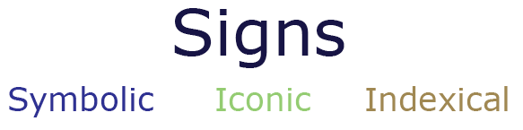
Signs

A smile is a sign could have many meanings in the language of facial expressions.

Screen shot 2014-04-16 at 12.13.12

A popular example is the system of the traffic light. Traffic control systems work as a language there is no reason why red means stop or green means go you will only understand this if you are culturally proficient in reading the system of traffic lights understand how to react – these signs are arbitrary signs.

Screen shot 2014-04-16 at 12.16.07

Another common example is the word Dog (a symbolic sign) – in no way do the letters ‘d’ ‘o’ ‘g’ resemble a furry four legged creature however because we have learnt they dog means a furry four legged creature to we understand the meaning, on the other hand to a japanese speaker the word ‘Dog’ has no meaning.

Screen shot 2014-04-16 at 12.19.25

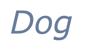
Another form on sign is an iconic sign for example a drawing of a dog can be understood by japanese speakers and english speakers alike however is it just as much a sign of a furry four legged creature than the word ‘Dog’.

dog


Signifier and Signified

A great example of this is ‘the rose’

If the rose is on a rugby shirt is that signifier is pointing to a signified of national branding for the english rugby team – again if you where not culturally profitient you may not understand this.

Another context could be a rose on a card in this context the signifier points to a signifier which means love  or passion in the context or a valentines card.

So in both contexts the sign is the same but the signified is different.

Denotation and Connotation

For a designer the idea of connotation is perhaps one of the most important aspects of theory. This is because the designer is trying to control connotation, although, as we will see, this is not always possible.

Let us first look at denotation. This means “what you see” or a simple description of, say, an image or what somebody said. What something signifies is also what it denotes.

Connotation, on the other hand, is what these things that you see or hear make you think of. What mood or thoughts do they conjure up?

For example if you hear the word ‘Dog’ you will most probably think of a furry four legged creature however somebody else may be thinking of a different breed taking connotation further another person may feel scared depending on their personal experiences with dogs.

Try this out on some images. Describe what you see or what the image denotes. Then build up to suggest what the image connotes for you.

Spider


Denotation – Photograph of a spider

Connotation – Photograph of a deadly spider – fear, death.

Connotation is personal

The connotation of a communication is potentially different for every person. Because connotation is built on your own past experiences, your beliefs and your expectations, the resulting thoughts are very personal.

Your own ideologies are based on things like your age, gender, ethnic origins, religion, politics and so on. These also colour your connotations.

Even things like recently being bitten by a dog will make you have specific connotations when you see an image of cute puppy! Or being hungry will make you view a food advert differently than if you feel ill when you see it.

So if you hear about a “city”, how do you know that your connotations are anything like anybody else’s? If I say the word “elephant”, what elephant or elephants are we discussing? Is your idea of “elephantness” or of individual elephants the same as mine?

Connotation and meaning are united

Connotation is about the meaning of a communication. The words a person says do not necessarily convey the full meaning or “agenda”. Instead you pick this up in the connotation. The context of what is said, the tone of voice and so on lead you to gather deeper meanings. The same can be applied to connotations of visual communications.

Connotation is in layers of meaning

There can also be layers of connotation. You may, for example, “get it” that an advert for a soup connotes that it is healthy and good for you, even if the advert does not say this overtly. They way the soup is treated, the packaging, the narrative of the advert, will all help the viewer connote the “right” message. This is the designer’s job.

However, your own opinions or experiences about soup will give you another, deeper layer of personal connotations. You may have been ill last time you are that brand or flavour of soup. Your health, diet or religion may prohibit you from eating it (it’s pea and ham, for instance). Or you may feel that the way the soup is shown in the advert makes it look, inadvertently, like vomit!!

All parts of a communication connote meaning

Every part of a communication will contribute to the connotations.

Imagine that you have made a fantastic design that ought to look great and connote that you are a skilled and imaginative designer. If you mount it badly, or smudge it, the overall connotation for the viewer will be one of carelessness.

Meanwhile, good paper stock will tell the viewer that a design is about quality and sophistication. Think of a wedding invitation printed on computer paper. What would that connote about the wedding itself, as well as the invitation designer?

Within an image all of the visual elements will potentially suggest connotations. This is why artists and designers select particular styles and materials with which to create their work.

Similarly, written or spoken words will connote meanings by the way they are chosen, combined or applied. Written words will connote by the typefaces, scale and context that they are set in.

Connotation is learned

If connotation is based on your own experiences and knowledge it means that it is learned, not inherent or instinctive. Connotations can change as you learn more about a specific communication, or as your own experiences develop over time.

Connotation means that nothing is objective

If, in order to connote anything, you have to have learnt it, it suggests that nothing is “real” in the sense that it can be known instinctively. It suggests that everything only ever takes place in your own head. That is your subjective world – is there anything objective and “true” outside of your own experience?

Does denotation exist?

There is one problem with denotation, however. In reality it is the lowest form of connotation. In some cultures in the world things like perspective do not exist. So showing someone from here a sketch of a road going off in the distance may to you denote “road, going off in the distance” (and connote travel, journey, passing of time or broken down car…). To the person who has never seen perspective the sketch may simply denote “black marks on a white background, with some yellow lines on it”.

So even to denote something from a communication, a person needs to be familiar with the “language”, whether that is spoken or visual This means that even denotation is learned and not instinctive.


Can designers control connotation?


Answer these questions:


  • When 5,000 people see a typical advert promoting a new fruit drink with a unique selling point that it contains only natural sugars to give you energy, do they have the same connotations?


  • But do they “get it” (have connotations) that it is healthier than a drink with ordinary sugar in?


In general, most people seeing an advert or other piece of graphic design will probably have the first level of connotations to “get” the advert. This is because people’s lives are similar to an extent and a society will have shared ideologies and experiences that enable connotations to be easily triggered. If you think about it, without sharing connotations on the first level there would be hardly any understanding between people at all!

Remember “hailing” and how texts, or communications, “talk to” or address or hail the reader. The social context and the relationship between the text and the reader will prompt various connotations.

However, the designer of the advert cannot be sure of the next level of connotations. Some people may be annoyed at the people in the fruit drink advert; others may think they are attractive. Some people may feel disgusted by the thickness of the drink whereas others will like that. Some people will think the natural sugars selling point is a scam or pointless; others will really like the idea and buy the drink as soon as they can.

So why should designers check their work for connotation “problems”?

Designers need to control connotation as much as they can in order to help the effectiveness of their communications. The point of an advert is to sell something or change attitudes. This can only be done if the viewers have positive connotations and favour the communication.

Connotation problems can arise when a designer does not understand the cultural issues of a society. Perhaps colours have meanings that the designer is not aware of. McDonalds, for instance, were successful accidentally in China because the red of their identity was considered a fortunate colour. Again, some brands have failed because their names mean something else (negative or rude) in other languages.

Other connotations can happen when a drawing or photograph looks like something it is not meant to do.

Picture 1

Sign: the smallest unit of meaning. Anything that can be used to communicate (or to tell a lie).

Symbolic (arbitrary) signs: signs where the relation between signifier and signified is purely conventional and culturally specific, e.g., most words. : a mode in which the signifier does not resemble the signified but which is fundamentally arbitrary or purely conventional – so that the relationship must be learnt: e.g. language in general (plus specific languages, alphabetical letters, punctuation marks, words, phrases and sentences), numbers, morse code, traffic lights, national flags;

Iconic signs: signs where the signifier resembles the signified, e.g., a picture.

Indexical Signs: signs where the signifier is caused by the signified, e.g., smoke signifies fire.


Semiotics Info-graphic Initial Ideas

This project fell over the 3 week easter break so to keep the ideas flowing during this period, Sarah, Kirsten and I emailed back and forth some initial ideas and gave feedback to each other.

Key:
Kirsten’s work = Blue Writing
Sarah’s work = Orange Writing
Charlotte’s Work = Purple Writing

Kirsten began by sketching some Venn Diagrams to show the separate parts of semiotics and how they link together to create the whole theory.

Screen shot 2014-05-08 at 15.47.01


She then created mock designs on illustrator.

Screen shot 2014-05-08 at 15.32.25

Below are some mock up I designed on illustrator, the idea is that the person is looking at the word dog, the inside of the brain shows the process of denotation and connotation. I also wanted to create a colour scheme as during my info graphic research I noticed that many use a maximum of 5 colours.

Screen shot 2014-05-08 at 15.56.11

Kirsten created a design that merged the use of a Venn diagram and the brain togetherScreen shot 2014-05-08 at 15.42.29

Below is Sarah initial idea and her description of it

‘Semiotics is the art of signing or signifying – pointing the viewer directly to the message you are trying to convey in your design.

The dictionary definition of course sums this up aptly: “the study of signs and symbols, especially the relations between written or spoken signs and their referents in the physical world or the world of ideas”.

So my mind kept going back to physical signs, and whereas signposts are rather too obvious (even though visually they may differ around the world), I like the way English village signs tell a little story of the place itself and sometimes its history.

Mayfield, in Sussex, is a prime example with its portrayal at the bottom of its happy sign (below) of the much darker, fiery battle between The Devil and St Dunstan – a legend that is still celebrated in an annual pagan festival today, preceded by a torchlit procession through the nighttime streets. It is a wonder to behold.

The story goes that St Dunstan, then the village blacksmith, pinched the Devil’s nose with a pair of red hot irons and the Devil fled in pain, howling.

It is also said that St Dunstan pinched the Devil’s nose right off and threw it into the sky, and it landed in an open space that then became Tunbridge Wells, after the nose turned the waters of the Chalybeate spring red. Which could explain why it has such a history as a Devilish town.’


Screen shot 2014-05-08 at 16.23.45And Kirsten’s approach to this...

Screen shot 2014-05-08 at 15.34.39

Semiotics Info-graphic – Initial Drafts

My initial draft began with just a vector image of a persons head looking at the word dog (this is the sign) in the second draft I added denotation in the form of a silhouette of a dog, connotation comes next for this I added a snarling dog and a bitten hand with blood droplets.
Screen shot 2014-05-08 at 15.56.11

I added a title, the main bulk of text and circles in the head instead of a brain at this point I was still experimenting with colours however I can see a blue/turquoise colour scheme developing.
Screen shot 2014-04-28 at 16.51.38

Screen shot 2014-04-29 at 22.04.38

Screen shot 2014-04-29 at 22.14.43

After the easter break Kirsten and I redesigned the poster for the final piece we added another head to make it look as though the two people are having a conversation, included The Independent Logo and refined the colour scheme.

Below are the fonts we compared, we chose Trajan Pro as it makes a very good title font being completely in capitals, we also thought that being a Serif font it suited The Independent newspaper well.

Screen shot 2014-05-09 at 07.48.43

Picture 5

Here we used a grid to line everything up ensuring a symmetrical layout…Picture 6 Picture 7 Picture 8 Picture 11

Add finally added the descriptive history for Charles Pierce and Ferdinand De Saussure.Picture 16

Semiotics Evaluation & Reflection


Evaluation and Reflection:


1) Visual Communication:


In what ways does the visual communication/message of the piece meet the needs of the brief?

We included all the necessary information – a background to the theory, what the theory consists of and examples of how this is used. We displayed this in a visually attractive way using images as well as text.

I think the overall visual communication is effective – Semiotics can be difficult to get your head around by the best of people so our aim was to make sure an adult could understand this, I tested this theory on my mum and dad.

In what ways does the visual communication/message of the piece fail to meet the needs of the brief?

It could be two text heavy in parts – however there is a lot to say in semiotics so I think we did well in breaking up the text to make it more manageable to read.

What are the strengths of the visual communication? Why?

Strong Images and colours make it an eye-catching poster, while also making it easy on the eye to read

What are the weaknesses of the visual communication? Why?

I think it’s all very clear.

In what ways could the piece be mis-read or mis-understood by the audience? Be specific about who the audience is.

Within the first head the speech bubble could be mistaken for a thought bubble, however after they read the main text if should all be understood!

In what practical ways could the piece be developed or improved?

By adding some more Bold type such as enlarged headings to make it seems as though the text is an image.


2) Reflection of own working practices:


Be very honest with yourself in this section. Please feel free to approach a member of staff for help finding ways to develop skills.

How was my time keeping?

Good, we exchanged ideas over the summer holidays and then in the couple of weeks we where at uni we focused on creating a final poster using everyones input.

How was my analysis of the brief?

I think the brief was relatively straight forward our challenge was to work successfully in  team, which we did.


How was my research?

I think its safe to say that I fully understand semiotics and find info-graphics a great way to visualise data!


How did I draw conclusions from my research?

I divided my semiotic research into  categories

Introduction


History

Denotation

Connotation

Signs

I did this so that when it came to putting the text into the poster I could easily find the part I was looking for!

How did I use research to generate and develop ideas?

See above!

How did I use evaluations to help with my ideas generation and development?


How did I use experimentation during the project? How can I make this more effective?


In what ways did I show that I had achieved the Learning Outcomes? How can I improve this next time?


What parts of the project did I enjoy most? Why was this the case?

I really enjoyed making the poster – I find it fun working with vector images they are very simple but when put together in an interesting way create an interesting design.


What parts of the project did I enjoy least? Why was this the case?

Nothing.


At what times did I work best? Why might this be the case? How can I ensure that I work well at al times?


What areas inspired me? Why was this the case? How could I follow these up?


What areas were challenging or difficult?  Why was this the case?


How can I go about developing and improving  the parts I found difficult?


Do I need to develop certain skills? Do I need these now? Or later?


Any other points?

Design Factory Brief Part 1

Design Museum Research

Visit an exhibition at the Design Museum as a stimulus for your research. You could approach either:
Paul Smith, Which explores the career of the fashion designer responsible for reinventing and exporting an ‘English’ style creating a globally recognised brand. How has Paul Smith defined and interpreted British style and identity? How does place perform and manifest in his work?
Or
In what way is there work of Barber& Osgerby, the designers of cultural icons such as the Olympic torch and the £2 coin, British? What is Britishness; how is it displayed in the show and in the duo’s approach, style and the engineering of their work?
Demonstrate your research findings through the production of:

  •  Visual data – drawings and photographs
  •  Written data – this should include critical and analytical reflection

Book Cover Brief

The Brief

In this project you will be designing the cover for a book. You will be expected to complete this work in one day.

Design covers for a penguin-type paperback books.

This should include front cover, spine and back cover.

The Natural History of Britain and Ireland

By Virginia Graham

Back Cover Blurb:

The natural history of Britain and Ireland is both well-loved and fascinating. Each biological grouping is introduced and explained in an engaging and highly informative way, making it the perfect addition to every family bookshelf, as well as an ideal gift for every nature lover.

Packed with stunning, specially commissioned photographs and a wealth of information The Natural History of Great Britain and Ireland updates what is known of the wildlife and landscape of our islands.

Audience

Penguin is a well know publisher, typically I knew them for children’s novels such as The secret garden however they also publish non-fiction books for an older audience, the cover I am creating would fit into this category targeting adults looking to add to their collection of books, I must also bear in mind that this may be in a family’s book collection  so the best design would be one that engages the young and old.

img_6129

Book Cover Development

Taking inspiration from a fashion trend book I wanted to create a montage/collage of flowers on the front cover, my first course of action was to find some good quality images of flowers that I could blend together quickly.

IMG_0628

When looking for flower images I came across a book I was given by GFSmith featuring different types of paper each with a flower printed on, the flowers where in an array of different shades. I scanned these into my computer for the best quality.

Picture 4I then took these individually into Photoshop to remove the background so that just the flower remained.

Picture 10Picture 11

I then setup my document on inDesign, to create the front, spine and back I used three pages and changed the width of the middle one – the dimensions i’m using are from the book above which I aim to cover with my design.

Screen shot 2014-01-30 at 11.46.13

Screen shot 2014-01-30 at 11.46.21I added the flowers to cover the whole front and back, I wanted to keep the front and back bare with the exception of the title and penguin logo to I added two more page to either side creating a sleeve, on these pages I added the blurb and a picture of a female author.

Screen shot 2014-01-31 at 15.13.59

Screen shot 2014-01-31 at 15.19.41

I am going to make a few changes before I include this piece in my portfolio, firstly I will print it on a thin glossy paper and foil over the writing and logos.

Editorial Design Brief

1) You are to design layouts for two double page spreads for a fictional magazine called, Photography Now. The layouts should showcase your own photography on the Environment topic. How many images you use in your spreads is up to you. The format of these pages is  200mm x 200mm per single page. You may design in any creative style that you wish, based on your research findings (which you must evidence). You must use only Quark or InDesign only for layout.

2) You will need to have created a body of research and planning for your photos. You must show links between this and your editorial layout. You will need to have a body of photography work completed fairly quickly. You may use stock photos while planning your dummy layouts; but your final must contain your own imagery.

3) You will need to have created a body of research in which you explore exemplars of editorial design. You should try to make analysis, using overlays, of the underlying grid structure of some of these. You should also comment on styles used. You must evidence links between this and your layout.

4) You must also write and layout within your spreads, a piece of text of between 200 and 400 words. This will be a personal justification of how you approached your photography. You should consider and use appropriate application of typography to set this text.

Design Factory Exploration

Paul Smith and british boot maker John Lobb collaborated on three special edition shoes.

Where is the identity in this object?

John Lobb is a well know british boot maker and the classic oxford shoes created by him have been worn in britain for over 100 years, I like the outcome of the collaboration because the oxford shoes are associated suits, work and high classes of people, by collaboration with Paul Smith the shoes that where once fairly boring now have a coloured inside which adds subtle quirkiness to the shoes.

IMG_0046

I would love to have this teapot in my kitchen! it was designed by Paul Smith for Thomas Goode and is sold in store for  £360. Thomas Goode is recognised as the best bone china producer in the world.

The stripes are achieved on the fine bone china by a way of slide lithographing, which is fired and fuses to the surface of the wares. The finer details are then expertly hand painted and glazed. The gold used on the detailing is a liquid gold leaf (28%), equivalent of 22 carat gold.

The teapot is definitely an iconic british symbol, the rest of the world  stereotype that drinking tea is part of british culture.

I like that Paul Smith has redesigned something very traditional to british lifestyle.

IMG_0042

Much like the Thomas Goode Teapot Paul Smith has used his iconic stripes on a Mini Cooper.

The 1997 Paul Smith Mini will be the latest addition to our showroom as of 7th July until early September.

This 86 stripe, 26 colour design is charecteristic of Paul Smith’s 1997 collection with the original project being prompted by his use of a Mini as a motif on a women’s skirt. The final paintwork represented the essence of his style exactly and this became one of three designer mini’s by Paul Smith.

The car was unveiled at the Tokyo Motor Show in 1997 with only 2 verisons being produced.

Techinical Stuff

Engine Four cylinder in-line engine
Displace 1275 cc
Power o 46 kW/63 bhp at 5700 rpm
Transmi Four-speed manual gearbox
Dime 3100 x 1440 x 1351 mm
Unladen weight 770kg
Maximum speed 148 km/h (92 mph)
Bore x Stroke 70.6 x 81.3 mm
Front brakes Hydraulic disc brakes
Rear brakes Hydraulic drum brakes

IMG_0017

These lanyards where created by paul smith for his fashion shows, if it fits the brief I could use Lanyards to display britishness for the Design Factory Competition. I like that in something so small you can say many things, they are in expensive and object many people collect and keep.

IMG_0030This was Paul Smith’s first show room in a Paris hotel, it is made from card board and paints this gives the effect of a sketch on paper as though the memory of his first show room has been sketched.

IMG_0021

IMG_0025

This drawing was amongst Paul Smiths collection of artwork, the fact that the black and white zebra is asking “is that a Paul Smith coat?’ shows the identity in his iconic stripes, regardless of what object they are painted on they can always be associated back to him.

I could use this idea for my Design Factory piece by using an object completely un related to Britain and altering its appearance so people associate it with Britain.

IMG_0089

Audience

The Editorial I am designing is for a fictional magazine called Photography Now, I must decide what kind of magazine it is to determine the customer.

To start I compared real magazines to see which category mine fit into.

Picture 1Comparing these Photography magazines has given me an idea of the types of different categories my articles could fall into, the pictures I have taken are of Ramsgate harbour many are very ‘pretty’ and would fit into the amateur photographer magazines, however I could base them around an informative articles on the storms that have taken place on the South Eastern Coast and place it into the British journal of Photography.