Berlin

I recently visited berlin and decided to do an article for creative review about the city! All the pictures use are my own and I gained research just be being there…

In Berlin every corner you turned there was street at some big that covered wholes buildings and some the size of your hand dotted around on objects, I wanted a big focus to be on the street art so I Included this image from the Berlin wall, I then created the word BERLIN to match the colour from the image.

Screen Shot 2014-09-19 at 13.42.45

Screen Shot 2014-09-19 at 13.45.10

For the main body of text I used information from leaflets I collected while in Berlin and also the internet to comprise the writing.

Berlin is a very cultural city with a lot of history and museums, I would have like to visit more museums while I was there but we only went to one which was the Jewish museum, this was very contemporary and focused greatly on the design of the museum for this reason I think it merited being in my article.

Screen Shot 2014-09-19 at 13.47.55

Another great part of Berlin is the nightlife, I wanted to portray just how strange it could be and so I wrote about an ‘underground’ club called Dr. Pong.

Screen Shot 2014-09-19 at 13.49.27

Fashion Failings Content


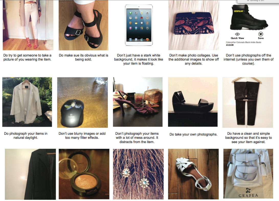
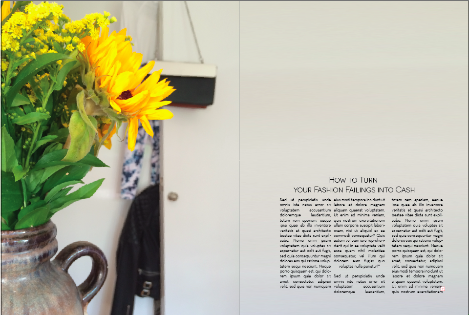
The content of the double page spread involved me taking my own photo for each of the do’s and don’t of Depop, The tips themselves were from the Depop app.
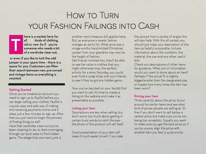
Screen Shot 2014-09-19 at 13.35.40The body copy consisted of my own text, I used internet research to form this.

Screen Shot 2014-09-19 at 13.37.41

And the image on the title page was also my own


The Stylist: Article appearance

I was hard pressed to find a double page spread in the Stylist as there are so many Adverts which is expected from a free mag.

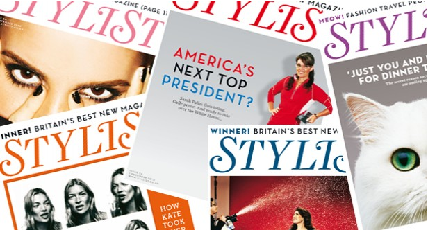
The stylists is a rectangular format (288mm (H) x 214mm) which tends to use a bold image for its cover. Most articles contain are large image or photograph on one page then more text on the next page. the images are very neat, contained in square or rectangular shapes, while the text is set out in columns this can range between 4 – 5 columns per page.

IMG_3797 IMG_3798 IMG_3799


FONT


Stylist Logo
Stylist Logo


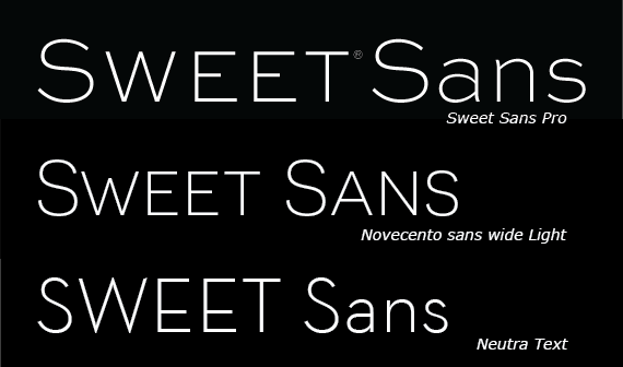
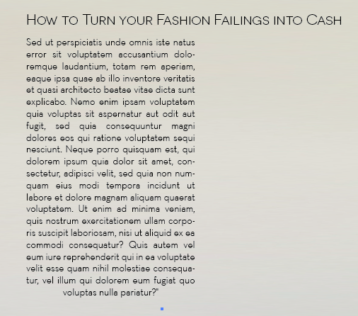
IMG_3803 2IMG_3803 I used What the font to find the font used for the Headings and body text the Headings are Sweet Sans Pro – Unfortunately you have to buy this font so I set myself to look for one that was similar.


Screen shot 2014-08-04 at 13.42.49I compared two free fonts to Sweet Sans Pro the first was Novecento sans wide Light – this was very similar however only came in Capitals which is fine for headings however I also needed a font for the Body text. I found Neutra Text for the body text.

Screen shot 2014-08-04 at 13.33.53


 For the first two pages I decided to stick with the traditional stylist layout using a large image on the left and a couple of paragraphs of text on the right, the two pages after will contain the main bulk of information and text.
IMG_3652 Screen shot 2014-07-30 at 09.43.22

Screen shot 2014-09-05 at 11.44.11

How to turn your Fashion failings into cash

Screen shot 2014-07-30 at 09.58.42

OBJECTIVE

To create a double page spread for London’s free Stylist Magazine

ABOUT THE STYLIST

Stylist is the title of a free weekly magazine for women that is published in the United Kingdom which launched on 7 October 2009.

THE AUDIENCE

  •  Monthly impressions 5.2m
  •  Uniques 661k
  •  Twitter followers 236.5k
  •  Facebook likes 56.8k
  •  Google Currents subscribers 1m
  • 95% Female u 67% Degree or higher
  • 70% Work full time
  •  48% London/South East
  •  ABC1 75%
  •  Average age 32
  •  Average income £29k
  • 65% of Stylist mag readers visit Stylist.co.uk at least once a week
  •  100,000+ subscribers at present u 83% ABC1 u 89% aged between 18-44 u Median age 30
  • Average personal income £29k u 87% have bought/booked something as a result of reading
  • Emerald Street u Average open rate 45%

DIMENSIONS

  • Full Page Trim: 280mm (H) x 206mm
  • Full Page Bleed: 288mm (H) x 214mm
  • Full Page Type Area: 266mm (H) x 192mm


Summer Type Project Brief

University of Kent at West Kent College

HND  Graphic Design

Year 1/2, Summer Vacation

Project:  Typographic Summer

Module: Graphic Design with Typography 2 [level 2]

The Brief

Over the summer please complete four double-page spreads about any topic(s) that you like. They can be about the same topic or different ones.

You should use some of your own imagery and wording, but can supplement this with found images and texts. Please make sure that you reference this clearly in your sketchbook or within the spreads as appropriate.

You should get your format for the page measurements from a magazine of your choice and then present the spreads as mock ups within the magazine. No A sizes will be accepted!

You should regard these spreads as portfolio pieces.

Assessment

While the module may be assessed as a portfolio towards the end of the second year, there will NOT be further opportunities to develop or improve this specific project so you should be careful to present the spreads as professionally as possible.

We expect sketchbooks with this work.

Over the summer you may submit PDFs or the spreads, or work in development to get tutor feedback. You will have ONE opportunity only to do this.

Submission Date: September  2014