HND 2 Graphic Design
Proposal
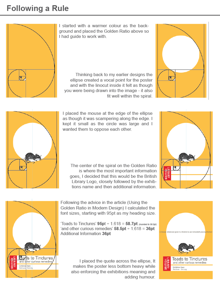
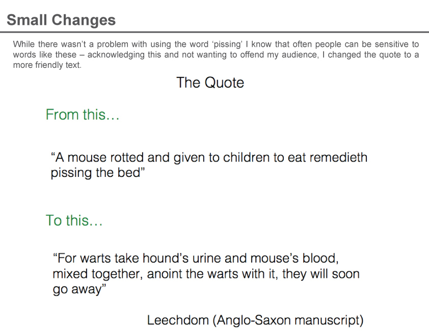
Introduction The British library is holding an exhibition based on the book ‘How to cure the plague and other curious remedies’ by Julian Walker and published by The British Library. This book presents a fascinating illustrated compilation of some of the most curious and disturbing cures from history, from the Middle Ages to the 19th century. Objective To effectively create a range of graphics that advertise and present the exhibition, the designs will consist of but not be limited to;
· Posters advertising the exhibition
· Banners (for buildings)
· Exhibition Program
· Exhibition graphics
 Exhibition & Evironment: Bibliothèque
http://www.bibliothequedesign.com/projects/exhibition-and-environment/
A design company Biliothèque has extensive experience in environmental design, from the V&A, Natural History Museum, Science Museum to The British Library.
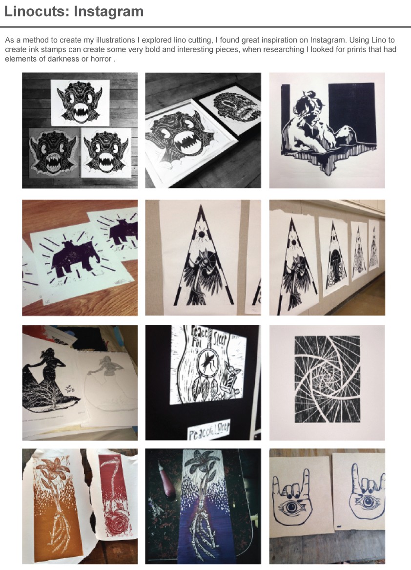
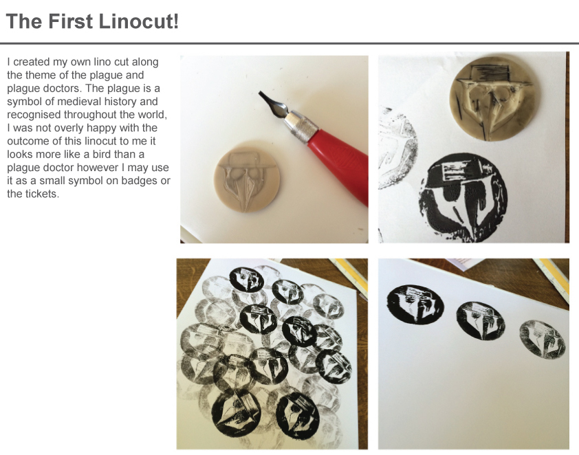
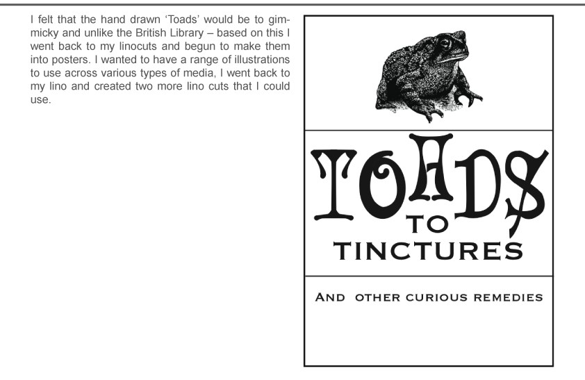
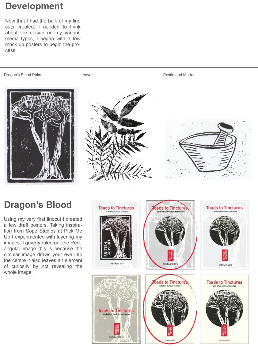
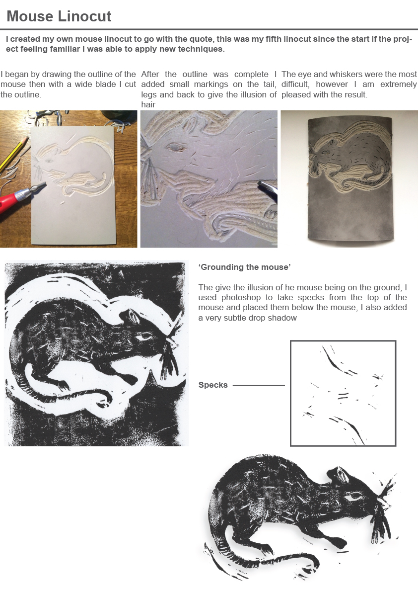
Using the book as a guide for my images, I decided to focus on the ingredients of the recipes, one involved the sap from the Dragon blood tree, this I drew as a linocut.
http://discovermagazine.com/galleries/2014/march/how-to-cure-the-plague
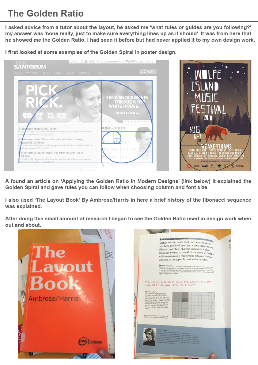
http://www.hongkiat.com/blog/golden-ratio-in-moden-designs/
Evaluation
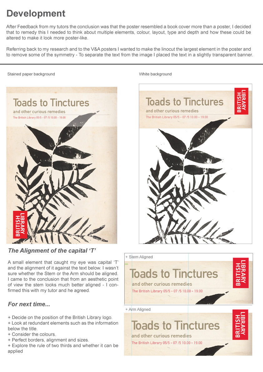
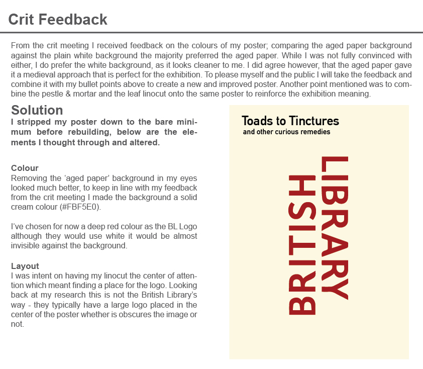
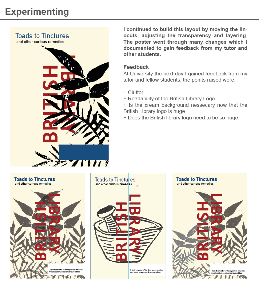
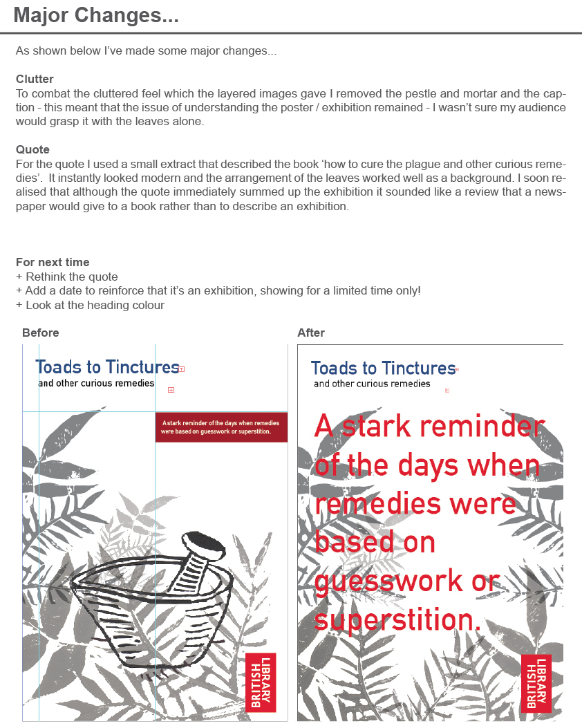
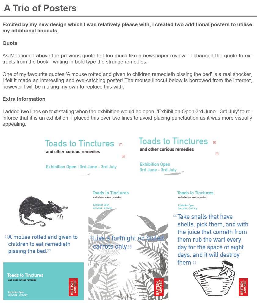
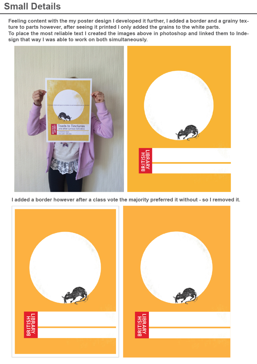
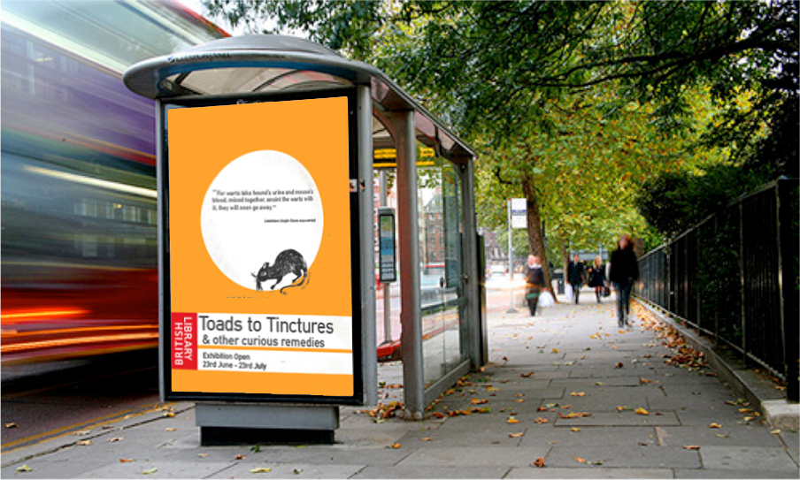
My over all aim was to design a range of graphics to present and advertise the exhibition. The poster to advertise had to be eye-catching and memorable. I wanted to go against the grain and create something different to the British Library’s standard graphics. I feel that the end result if an effective poster that immediately attracts attention. I utilised my existing linocuts on postcards, tote bags and mugs, the tickets I made had a modern feel to them and are printed on high quality paper.
The finish is professional and the pieces connect with each other – I am pleased with the result.
