Subcultures Creative Review Cover Brief

Create a cover and one double page spread for Creative Review. This must depict the subculture’s revival and pay homage to the first flush of that subculture. Be careful to create visual messages that are understood by the appropriate audience. Show that you have tested this.

Cover: You must incorporate an image that you have made yourself (in any media) and some wording giving a lead into the article. Consider your choice of typography carefully and relate this to your findings about the style of Creative Review.

Double Page Spread: You must check the style of typical Creative Review articles first and make sure that your design is appropriate. You may “borrow” a text about the sub-culture from the internet (giving the reference for the source in your sketchbook). You may use found images that are appropriate or you may make images yourself. Found images must be referenced within the page and must be of high resolution (300+dpi. No gifs). You will be down-graded for using low resolution images.

Make sure you know the both the format of Creative Review in terms of size and layout, as well as the kinds of style regularly used.

Subculture Research

What is a Subculture?

The oxford dictionary term for subculture is a cultural group within a larger culture, often having beliefs or interests at variance with those of the larger culture.

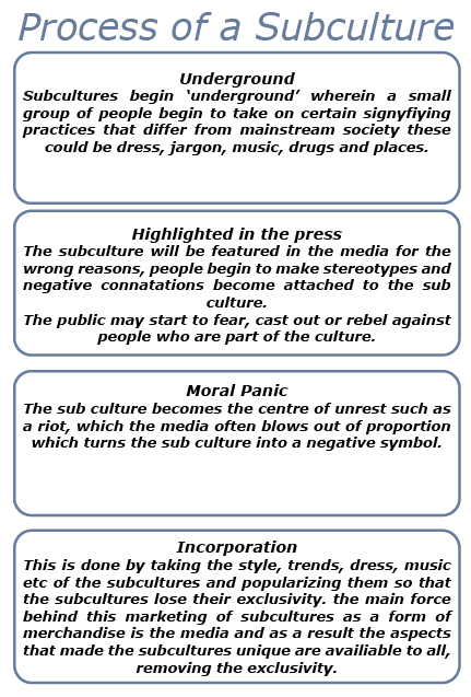
For this project I have to base a magazine article on a particular youth subculture. Youth subcultures are generally formed by the younger generation (although some within the culture may not be young), things that form theses groups are dress, jargon, music, drugs and places. These is differ from the mainstream music etc. there fore creating a sub-culture.
Quite often youth sub cultures can be associated with economic classes, gender and ethnicity.

Examples of Subcultures

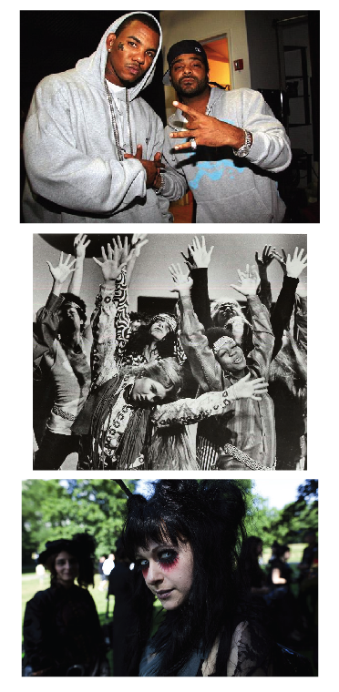
Some well known sub cultures are shown below are gangsta, hippies and goths.

Picture 25

Screen shot 2013-12-10 at 14.05.19

Subculture Research Zoot Suiters

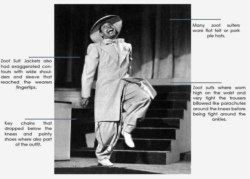
Zoot Suiters originated among young African Americans, in specific groups of young men. In harlem, early Zoot suiters where youths of the lower class, often marginally employed, who took pleasure in night life and spent their time in social club or gangs. This then spread to Mexican American youths known as Pachuco’s (another subculture) this group was known for showy fashion crime and drugs use – a rebellious group.

The name Zoot suit some people say had no meaning and was only part of a rhyming jive type speech common among African Americans of that era.

Jazz musician Cab Calloway wrote a jive dictionary in which he describes the word Zoot as meaning exaggerated a term applied to music and fashion.

Picture 7

Zoot suits where worn to announce their alienation and seperation from mainstream society, during world war 2 the manufacturing of Zoot Suits was forbidden and there was an increase in juvenile crime, and so wearing a zoot suit came with rebellious connotations.

“wearing a zoot suit was a deliberate way of flaunting the regulations of rationing”

Negative Media

Fights began to break out between zoot suiters – most often mexican american gang members and service men these involved arrests, attacks and excessive violence, articles in the press showed zoot suiters as the cause of the problem.

image19

 During the summer of 1943 , Los Angeles was a center for military activity where thousands of servicemen where stationed. AT the same time newspaper portrayed young zoot suit wearing Mexicans; for being unpatriotic and lowlife street thugs.

“The record already reveals killings, stabbings and cases of innocent woman having been molested by zoot suit gangsters,” read an editorial in the Los Angeles Examiner titled, “Police Must Clean Up L.A. Hoodlumism.

The book Zoot suit by Kathy Peiss states:

“On the night of June 3, 1943, a band of fifty sailor armed themselves with make shift weapons, left their naval base, and coursed into downtown Los Angeles in search of young Mexican Americans in Zoot Suits.

The Posse prowled the streets, searched nightclubs, and invaded movie theatres, forcing managers to turn on the lights so they could identify youths by their attire. When they found a zoot suiter they him, stripped him of his pants and tore his jackets. The next day, servicemen hired a convoy of taxicabs to go to east Los Angeles, where they accosted pachucos on the street and even pushed their way into private homes.

While many mexican americans retreated into their communities , some fought back, borrowing cars and traveling into the commercial district to confront the servicemen and their civilian allies.

Creative Review Research

A short descriptions on the Creative Review website says this,

Launched in 1980, Creative Review inspires, informs and stimulates debate across the fields of advertising, design and visual culture worldwide.

We aim to produce thought-provoking content covering graphic design, advertising, digital media, illustration, photography, typography and essentially, any other form of visual communication.

It is a high quality magazine aimed at professionals working within the arts and design scene, also students at university level studying Arts and other creative subjects. This covers male and females from the age of 18. I would also say the magazine is more likely to sell in urban areas where there is a larger population of business, particularly offices.

If I where proposing this professionally to a marketing department I would say my target audience is ABC1.

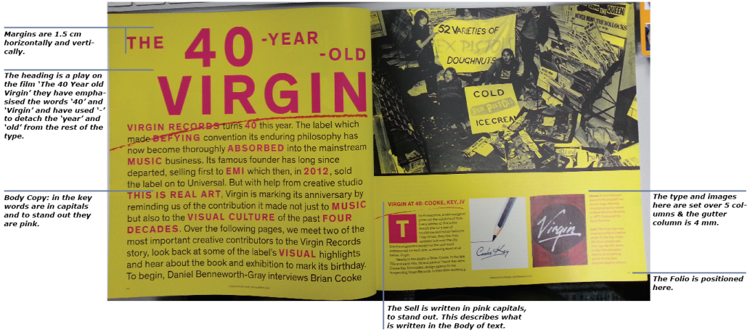
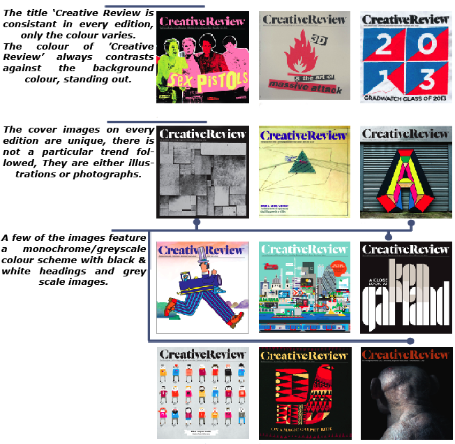
Creative Review is a square format which tends to use a bold image for its cover. Typically the articles contain a fair amount of text this can vary but the standard is around 50/50 (text/images), the images are very neat contained in square or rectangular shapes, while the text is set out in columns this can range between 3 – 6 columns per page, however 4 is the most used.

Picture 2

I compared a number of Creative Review covers as part of my research, The covers tend to feature a bold image which is quite often the work of a known artist, designer or photographer. They do not usually contain coverline text placing the main focus on the image with the expectation that the image alone will be strong enough to attract the magazines audience.
Picture 32

Creative Review Cover – Analysis

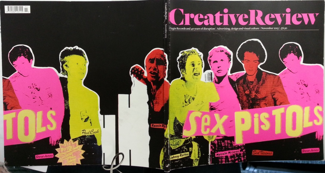
I looked at the most recent edition of Creative Review, the front cover was an image of the Sex Pistols from the punk rock era (very fitting).

20131204_105948

Image & Colour

In this they have used the cut and paste typography of Jamie Reid to emphasise the Punk Rock theme and have altered the photos colours to fit in with the style. The colours used are those from the punk rock era are are the same as a Poster created by Jamie Reid for the Sex Pistols (below). The black background works well as it causes the images and type to stand out.

The colours used are redundant elements, however they work well in emphasising the punk rock theme and it wouldn’t be as eyecatching with just black and white images.

punk-posters-001 sex-pistols-and-muni

Layout

The name ‘Creative Review’ is in the same place as in all editions, in the centre at the top of the page with the headline beneath it.

The front image takes up around three quarters of the page and is bled off the page, around the spine and continued on the the back of the magazine. The rear has more ‘white space’ than the front.

The layout is relatively simple which is the norm for Creative Review covers.

Type

The font used for the title ‘Creative Review’ is Dala Flonda Bold designed by Paul Barnes and the headline is Lyon designed by Kai Bernau.

Paper

The paper used for the cover of Creative Review is Claro 300gsm

Overall I really like this cover design, it is a statement peice and would catch the eye of the audience simply because of the bold colour scheme, Elements I could use within my own cover would be the continuation of the image onto the back of the magazine and the repitition of the colour used in the image in the title. Another part of this Creative Review edition I liked was the way the designer has continued the punk rock theme into the article inside the magazine by using the same colour, this make the article identifiable from the rest of the magazine pages.

20131129_103942

My aim is to make my cover and article as similar to those used in Creative Review as possible.

Creative Review Cover – Ideas

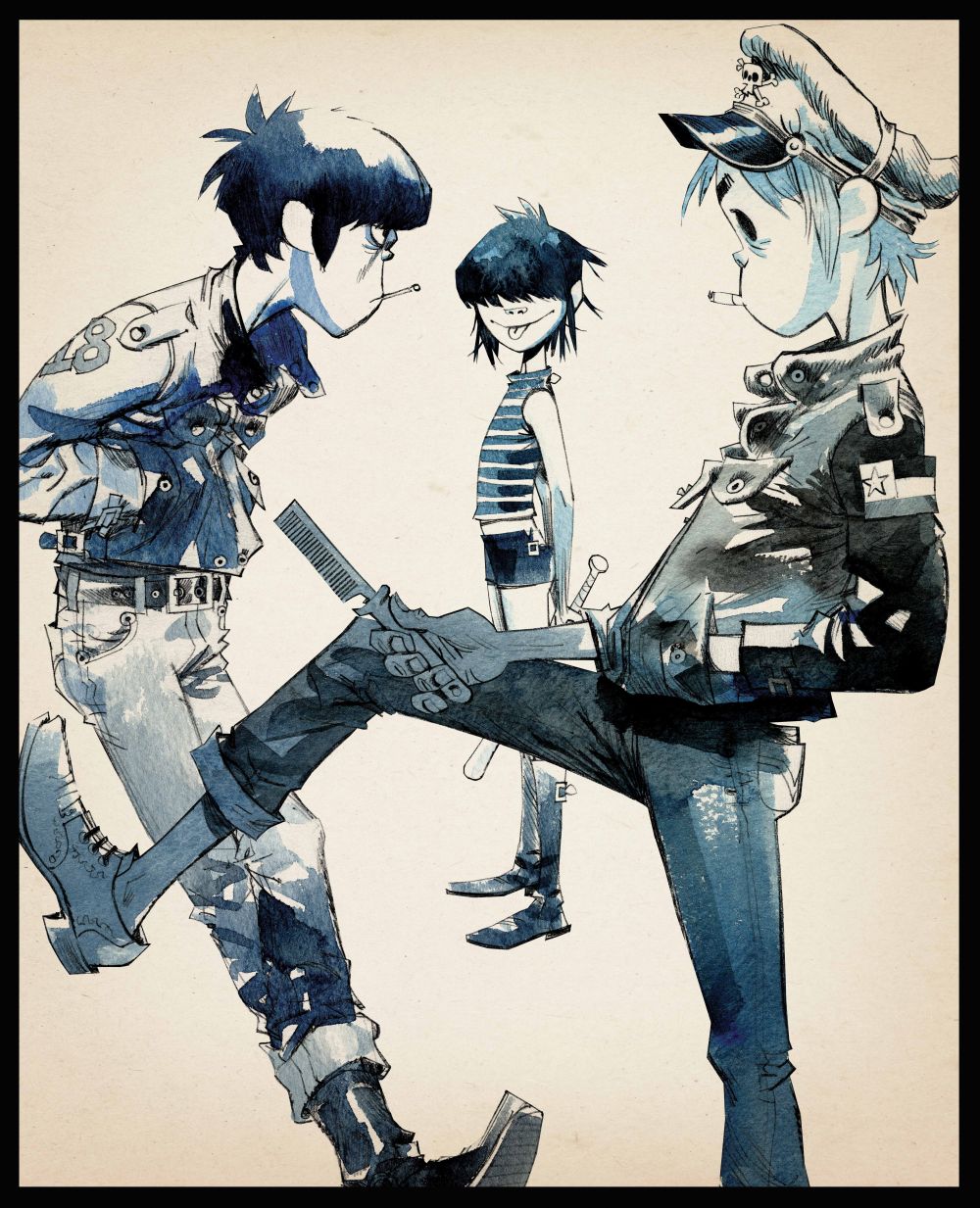
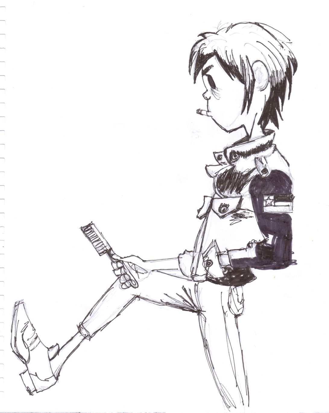
For the my front cover I have to use an image I have made myself, as my chosen subculture (Zoot Suiters) is from the 1940’s it was unlikely that I would be able to include my own photography so I decided to focus on illustration with the aim of drawing a Zoot Suiter on the front cover. I begun by researching illustrations of people in urban scenes, and came across work by Jamie Hewlett (designer of Gorrilaz art) I have always liked his style of drawing and  noticed it in the band Gorrilaz album covers and videos.

The characters he draws all have a certain look about them, they have strong expressions on thier faces such as a toothless grin or sticking thier tounge out or are often smoking, they look tough and rebellious (you wouldn’t want to cross them in a dark alley).

Why this style?

From my research into Zoot Suiters I found that African Americans and Hispanic youths wore the suit for slightly different reasons. The suits where exaggerated this alienated the wearers from mainstream society  by giving them a showy image, however the african americans wore it because it was exaggerated, they wanted to show of like peacocks and wore the suits in bright colours, the musician Cab Calloway wore it during the performances and Malcolm X wore his at the age of 15.

The hispanic youths on the other hand wore the suit as a way of rebelling against mainstream society they took pleasure in nightlife and where known for showy fashion crime, gangs and drugs use. Because they already had a bad name, during the rationing in WW2 people said they where deliberately flaunting the regulations of rationing this lead to hispanic youths in Zoot Suits being the targets of the Zoot Suit Riots.

For my cover image I am focusing on the Hispanic Zoot Suiter as I think it ties in more with the history of Zoot Suiters as they where the main focus of the riots.

tank_girl_cover gorillaz-illustration-picture gorillazweb The-Lords-of-Flatbush-∏-Jamie-Hewlett

Creative Review Cover – Concept

One particular illustration of Jamie Hewlett’s I loved and decided I could create my own Zoot Suiter Version.

The-Lords-of-Flatbush-∏-Jamie-Hewlett

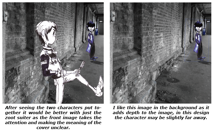
My idea is to have the front two characters in plain anonymous clothing, and have the background character dress as a Zoot Suiter with a similar expression on thier face.

I think this could work because the cover and article are about a revival of a sub culture, the character in the background looks as though it is intruding in the image and is there to cause trouble, this is what generally happens with sub cultures they creep in against mainstream culture and cause some form of trouble.

My only drawback which my tutor mentioned would be that the front two characters could draw the attention away from the Zoot suiter therefore confusing the meaning, I will create a version without the front two to compare.

Creative Review Cover – Design Options Cont.

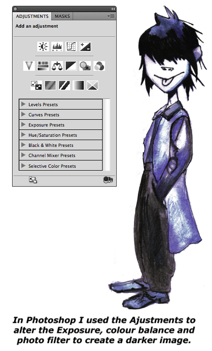
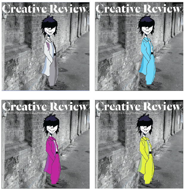
After looking at my previous cover ideas I feel that the Zoot suiter character I drew looks slightly messy, I decided to draw over this in illustrator to give him a cartoon like look.

Screen shot 2013-12-09 at 19.51.11

I am happy with the outcome of the image by using this technique in illustrator I was able to give him a more defined look, I will now test the image on different backgrounds for the final cover design.

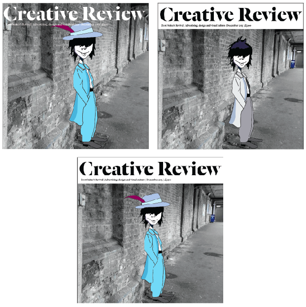
Screen shot 2013-12-10 at 13.03.54 Screen shot 2013-12-10 at 13.04.05

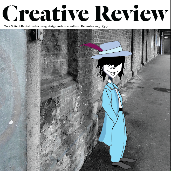
I have decided to go with this one! I like the white banner beneath the Logo as it is much easier to read, and the blue colour of the Zoot Suiter compliments the grey scale background while still standing out.

Screen shot 2013-12-10 at 13.01.54

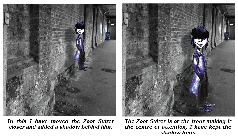
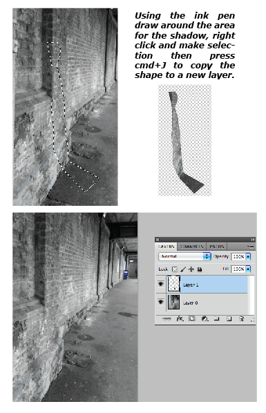
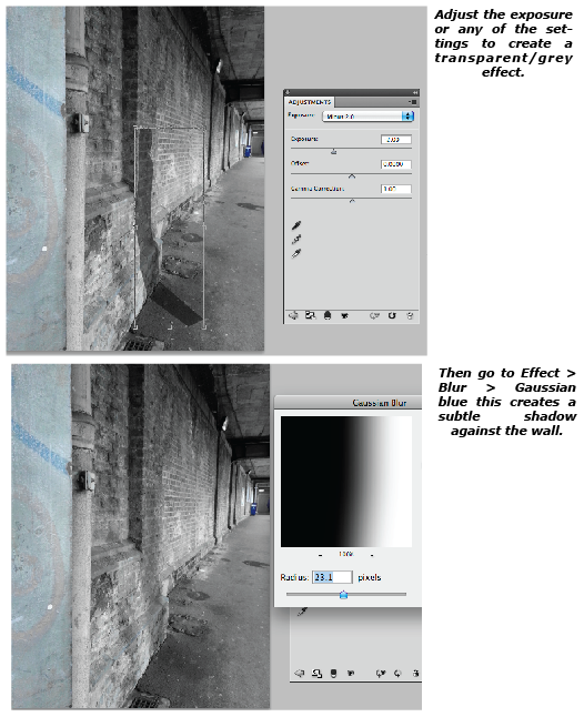
There are still a few changes I will make they are to remove the bin from the background and adding a shadow for the character.

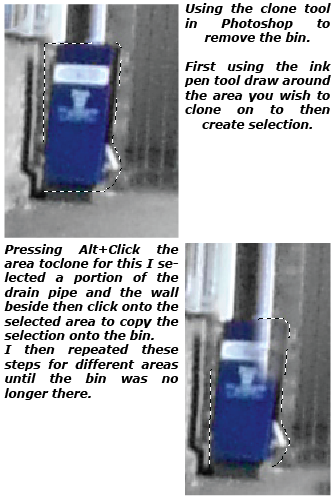
Technical Process – Cloning

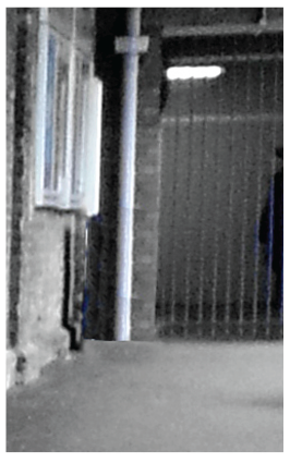
To remove the bin in the background I used the cloning tool in photoshop

Screen shot 2013-12-13 at 17.40.31

Screen shot 2013-12-13 at 17.58.03

While the result is not perfect, you cannot see any imperfections on the full size image.

Technical Process – Shadow

Screen shot 2013-12-13 at 18.59.06 Screen shot 2013-12-13 at 19.03.19

With the character added to the new background image the result was this.

Screen shot 2013-12-13 at 17.16.40

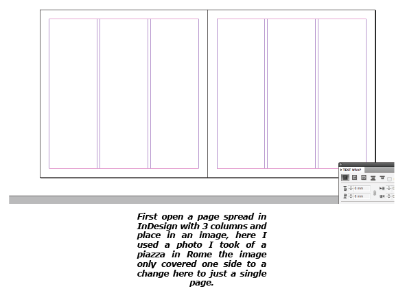
City Scape InDesign

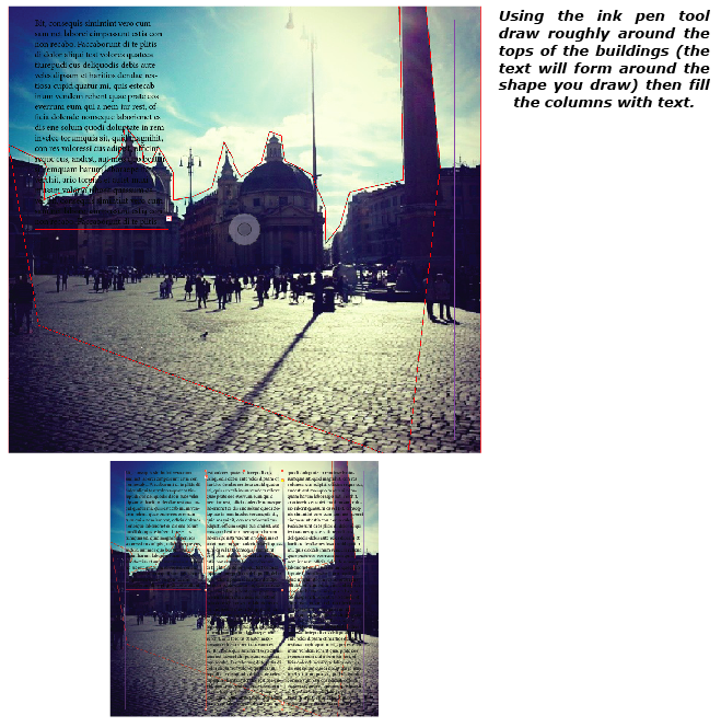
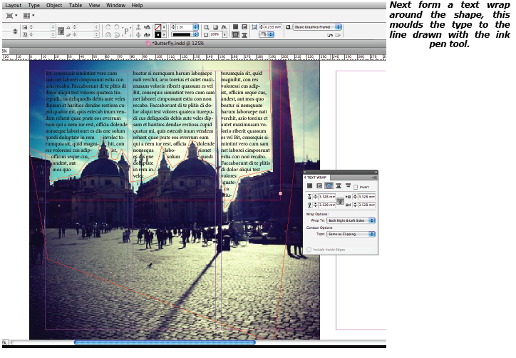
In class we created a simple layout using a city image and text, wrapping the text around a draw line to mould the text to the shape of the buildings, here’s how it’s done.

Screen shot 2013-12-13 at 19.32.46

1459178_10153507543910068_1673813278_n
Click to Enlarge

Screen shot 2013-12-13 at 19.34.27

Screen shot 2013-12-13 at 19.36.42

Picture 5

From this exercise I have learnt a simple technique to create an effective article, the text is still present but doesn’t interfere with the image you would want readers to see.

Creative Review – Double Page Spread Research

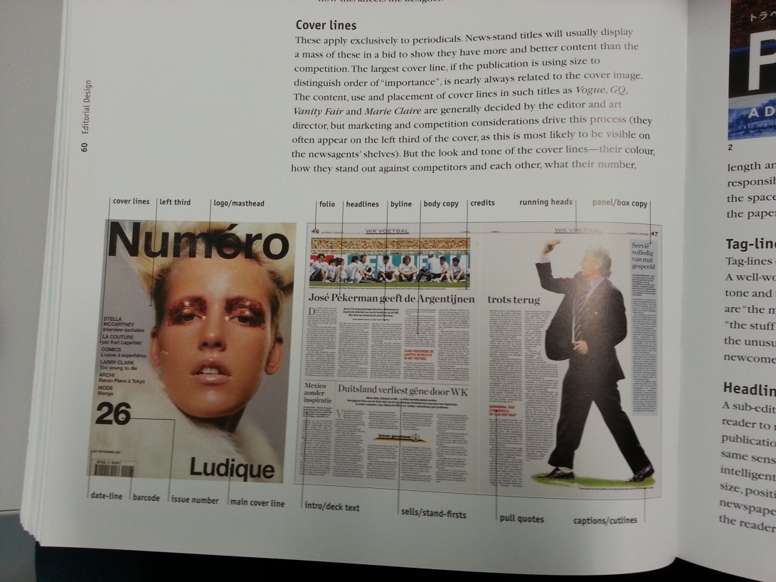
In the book Editorial Design by Yolanda Zappaterra I found an excellent peice about the different elements that make up spreads in magazines.

20131206_115139

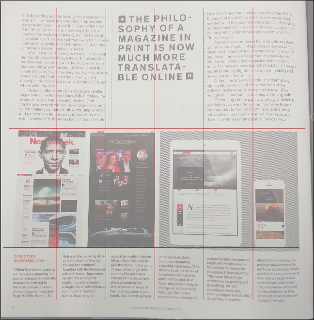
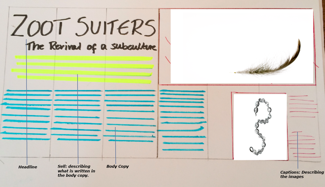
In Illustrator I was able to draw lines above an article to show the grid the designers used. Here they have divided the page into six columns, the body copy text at the top of the page has been split into three parts, beneath the images are divided into two and the text at the bottom of the page uses all six columns. The article is very neat, you can quickly tell the kind of grid they have used.

Screen shot 2013-12-10 at 14.34.28

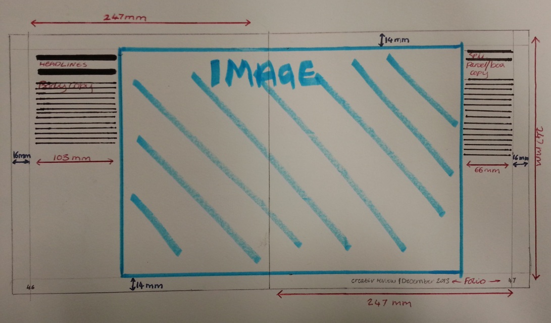
I began to look into the design of editorials in Creative Review, I chose a double page spread and took measurements of key design features, this will help me in designing my layout as I will have the measurements to create templates to work from in InDesign.

20131209_145635 20131209_144757

Creative Review Double Page Spread

Initial Design

I began to create my Double page spread based on a previous sketch, sorry for the poor quality image!

Screen shot 2013-12-13 at 15.28.53There is too much white space in this spread (even for creative review) and because this article would be the main feature of the magazine it needs to stand out. To add some interest I am going to;

1. Try altering the headline by either changing the font or adding additional colours.

2. Different images, the body copy is about the Zoot Suit Riots (not a very nice topic) therefore I think I need to include an image to do with the riots to add a link between the body copy and the images.

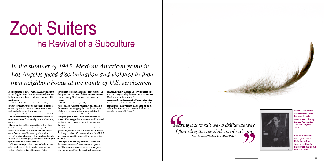
Second Design

Screen shot 2013-12-13 at 15.39.53

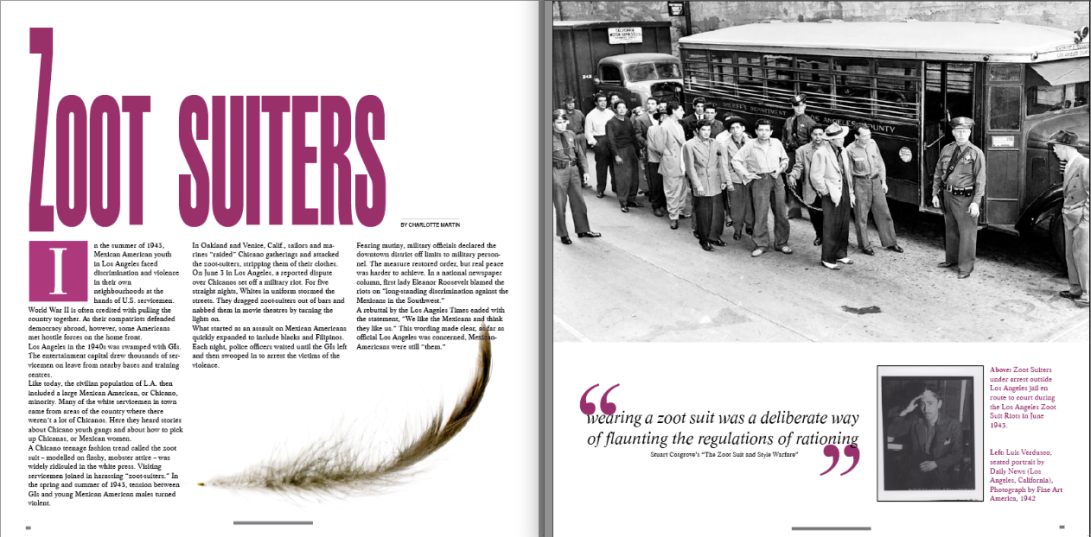
I much prefer this, Zoot Suits where extravagant and I wanted to include something bold and showy, while also keeping the seriousness of the article, I found a book cover which influenced my headline.

The stretched letters are clear in their meaning (extravagant) but not to much for the article.

n307278

Adding  ‘By Charlotte Martin’ has introduced an element where there was once ‘white space’.

The boxed ‘I’ there isn’t a particular reason, I like the effect it gives by starting/introducing the paragraph it makes the body copy seem less text heavy.

I have still stuck to the original idea of using a single image to portray Zoot Suiters but also including one of the riots, so that readers can visualise what they are reading it also adds sympathy.

The images I chose do not add colour and so I added the dark pinky/purple to the headline and other parts, my reason for choosing this colour is that it matches the feather in the Zoot suiters hat on the front cover.

Grids & Layout

This shows the principles of layout, it describes the basic elements needed to created a successful design, when it comes to me setting up my editorial on indesign will use the principles.IMG_0310

This I found in the book editorial Design By Yolanda Zappaterra it helped me understand was different grids where used for example editorial focusing on images will have smaller base line grids as text is less important.

IMG_0313

My editorial will adopt the features from the top left example, it will feature a large eye catching image to draw interest with a large headline and small amount of text – the main focus will be the photgraphs. The amount of white space will be dependant on the images I use.

IMG_0312

While some of theses technique may not be directly applied to my editorial I will take them all into cosideration while designing.

Evaluation & Reflection

Screen shot 2013-12-13 at 17.16.40

Picture 6

Picture 5

1) Visual Communication:

In what ways does the visual communication/message of the piece meet the needs of the brief?

I feel that the visual communication meets the brief well, I have used the sub culture Zoot Suiters and applied this to a modern day article for a well known magazine, I have thoroughly researched the sub culture and investigated the signifying practices that makes them who they are. One particular part I focused on was why the riots started, this all comes down to the media/press at the time who singled out the Hispanic Zoot Suiters which led to them being the targets of the riots this is an example of effective visual communication (even though the results where not positive).

In what ways does the visual communication/message of the piece fail to meet the needs of the brief?

Over I am please with my cover and double page spread, although I feel the double page spread could be improved slightly it still needs some tweaks to have every element in the perfect position.

 What are the strengths of the visual communication? Why?

The double page spread is very striking it stands out with the bold headline and strong colour, this was how I wanted to communicate the extravagance of Zoot Suits particularly in the Headline by extending the ‘Z’, It adds boldness while still keeping the seriousness of the article.

 What are the weaknesses of the visual communication? Why?

On screen the piece looks fine, when it was printed it wasn’t to the correct standard, I feel the images where not as clear as they could be.

 In what ways could the piece be mis-read or mis-understood by the audience? Be specific about who the audience is.

Creative Review is aimed at professionals working within the arts and design scene, also students at university level studying Arts and other creative subjects. This covers male and females from the age of 18.

If I where proposing this professionally to a marketing department I would say my target audience is ABC1.

I think it could be mis-understood by the audience – Zoot Suiters where from the 1940’s whereas Creative Review is aimed at young professionals so there could be a generation gap and the customers may not know what Zoot Suiters are. Also Zoot Suiters where from america so in England it wouldn’t be much of a revival – however it could be global which would make the article relevant to people working in the fashion and design scene.

 In what practical ways could the piece be developed or improved?

I should have left more time for the printing as the paper I chose was wrong for the printer so I ended up using a standard laser jet printer and normal A3 paper.

2) Reflection of own working practices:

How was my time keeping?

My time keeping was good until the very end, I was running on schedule until I had problems with printing which slowed me down, I also found that I spent a lot of time researching my chosen sub culture and not enough on layouts.

How was my analysis of the brief?

I interpreted the brief well enough, I feel I have covered the points, however my research into visual communication could have been improved

How was my research?

I researched Zoot Suiters very well but feel I could have researched Layouts/visual communication more.

How did I draw conclusions from my research?

I tend to compare things I have lightly researched and then focus on one or two which I would consider using for the piece.

How did I use research to generate and develop ideas?

I did a small amount of research to begin with – that was enough to give me a few ideas, I then looked into the ideas and focused on a particular one, for instance when I came across Jamie Hewletts work I felt I could merge it with the Rebel Hispanic Zoot Suiter to create a strong character for the front cover – and I did!

How did I use evaluations to help with my ideas generation and development?

At the end of every draft I said what I was and wasn’t happy with and what I would do to counteract the problems. This method would keep going until I was happy with the outcome.

I presented research from book and the internet and also generated my own research into effective layouts by creating my own in my sketchbook.

How did I use experimentation during the project? How can I make this more effective?

I experimented with the use of background images for the front cover, after I settled on one I altered the colour of the Zoot Suiter character and compared several. If I had more time I would have created more variations of the double page spread, in my next project my aim is to work faster and more effectively by researching and generating ideas quickly then focusing on three main ideas and developing from there.

In what ways did I show that I had achieved the Learning Outcomes? How can I improve this next time?

I showed all technical processes on my blog and explained them step by step with images, I researched all aspects of my chosen sub culture including process communication I also looked into what the sub culture meant to different ethnicity’s.

What parts of the project did I enjoy most? Why was this the case?

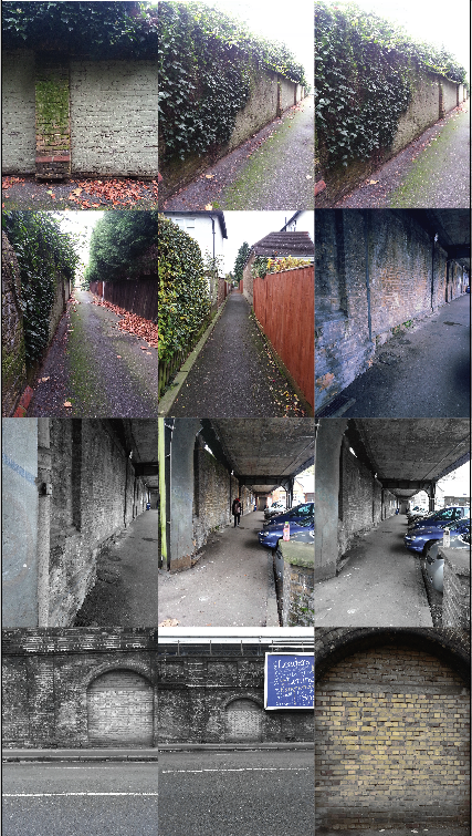
I enjoyed creating the front cover as it was a style of art I like and felt the photo I took myself worked well in the background.

What parts of the project did I enjoy least? Why was this the case?

The printing, I purchased some paper very similar to what is used for Creative Review, when it came to printing on this lovely paper the ink was runny and didn’t sink into it as well as I hope this resulted in the images being unclear.

To overcome this I printed on standard paper using a laser jet printer the image quality on this was fine however the paper did not have the finish I hope for.

What areas inspired me? Why was this the case? How could I follow these up?

I had a lot of fun exploring new photoshop techniques, Roger showed me how to clone and how to create a shadow, for my next project my aim is to self learn using books, magazines and the internet to improve my knowledge.

What areas were challenging or difficult?  Why was this the case?

Some areas where not so much difficult but very slow/tiring work, for example when creative the Zoot Suiter character for my front cover I had to draw on illustrator and ensure every line was joined together so that when it came to using the paint bucket it has the desired effect.

How can I go about developing and improving  the parts I found difficult?

With practice I hope I can find faster ways to do things.

Do I need to develop certain skills? Do I need these now? Or later?

Technical skills in Photoshop, In Design and Illustrator these are very important and I need these now  and will need them later.

As I mentioned above I will self learn new techniques using the internet etc.