Editorial Design Brief

1) You are to design layouts for two double page spreads for a fictional magazine called, Photography Now. The layouts should showcase your own photography on the Environment topic. How many images you use in your spreads is up to you. The format of these pages is  200mm x 200mm per single page. You may design in any creative style that you wish, based on your research findings (which you must evidence). You must use only Quark or InDesign only for layout.

2) You will need to have created a body of research and planning for your photos. You must show links between this and your editorial layout. You will need to have a body of photography work completed fairly quickly. You may use stock photos while planning your dummy layouts; but your final must contain your own imagery.

3) You will need to have created a body of research in which you explore exemplars of editorial design. You should try to make analysis, using overlays, of the underlying grid structure of some of these. You should also comment on styles used. You must evidence links between this and your layout.

4) You must also write and layout within your spreads, a piece of text of between 200 and 400 words. This will be a personal justification of how you approached your photography. You should consider and use appropriate application of typography to set this text.
Audience

The Editorial I am designing is for a fictional magazine called Photography Now, I must decide what kind of magazine it is to determine the customer.

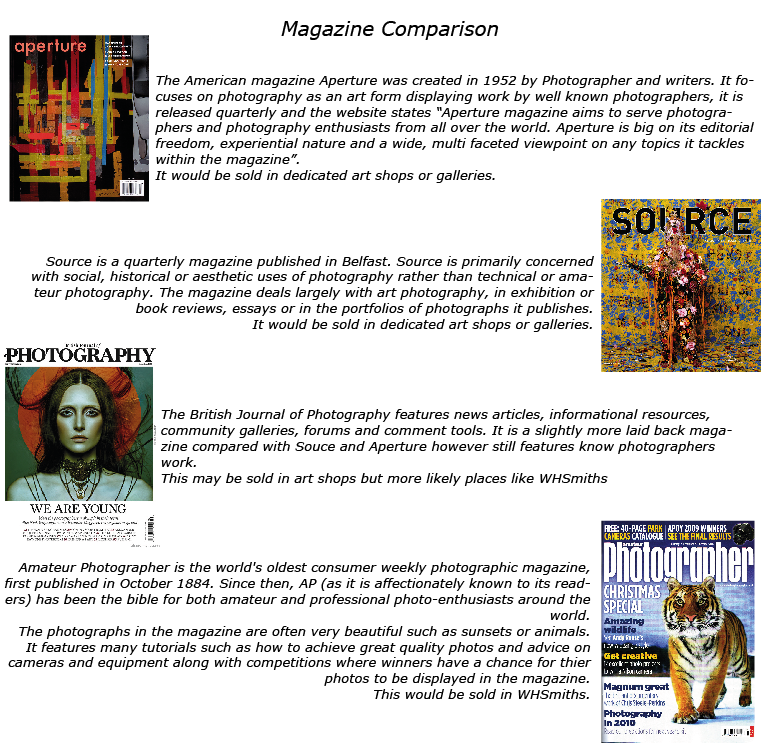
To start I compared real magazines to see which category mine fit into.

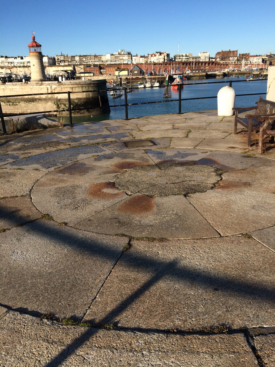
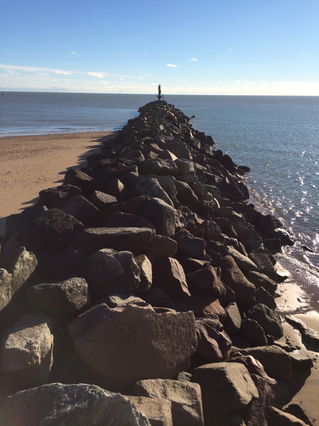
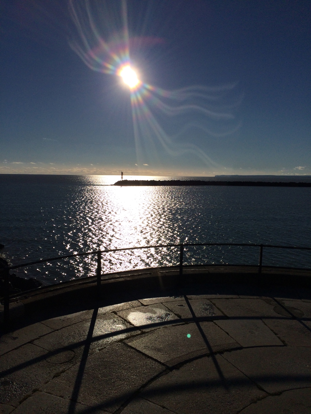
Picture 1Comparing these Photography magazines has given me an idea of the types of different categories my articles could fall into, the pictures I have taken are of Ramsgate harbour many are very ‘pretty’ and would fit into the amateur photographer magazines, however I could base them around an informative articles on the storms that have taken place on the South Eastern Coast and place it into the British journal of Photography.

Visual Communication

I looked back to a lesson we had on visual communication, in this we learnt what would aid us or prevent us from communicating succesfully.

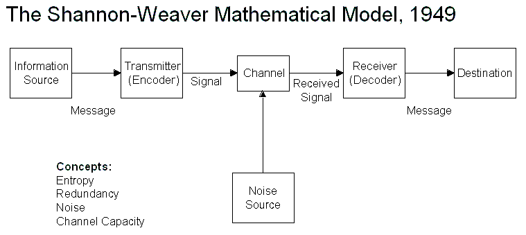
We looked at Shannon & Weavers model of communication.

Shannon-Weaver Model

Shannon and Weaver argued that there where three levels of problems in  communication

  • A The technical problem: how accurately can the message be transmitted?

This could be a printer not working, distractions, wrong size and commonly design noise – a more eye catching design which takes the eye away from yours, this could be a problem in a magazine if an article is sandwhiched between more eyecatching peices it may only be glanced at as the others would be taking the main bulk of attention.

Unless as a designer you where in charge of the whole magazine this could be difficult to combat, you can however make yours as eyecatching as possible.

  • B The semantic problem: how precisely is the meaning ‘conveyed’?

This the designer has control of, if research is done properly and the piece is in the right place at the right time in front of the right audience, The rest is what the designer has created and how well the audience understands this.

  • C The effectiveness problem: how effectively does the received meaning affect behaviour?

This is the outcome of the peice. eg does and advertisement increase sales of the product, if so then it has been visually communicated succesfully.

Before & during creating any peice I will refer back to the three points, I will begin by choosing my audience and making sure the peice is directed towards them.

Inspiration – Double page Spread

I saw this in the Book Editorial Design by Yolanda Zappaterra, The description in the book says this:

The December 2001 issue was our first after 9/11. Because of our two- to three- month lead time, the world had been saturated with the images of the Twin Towers being destryed by the time this issue was printed. We decided not to show any images of the destruction but use the space ot celebrate the past and look towards the future,” says Criswell Lappin, art director of Metroplis. This photograph by Sean Hemmerle did just that.

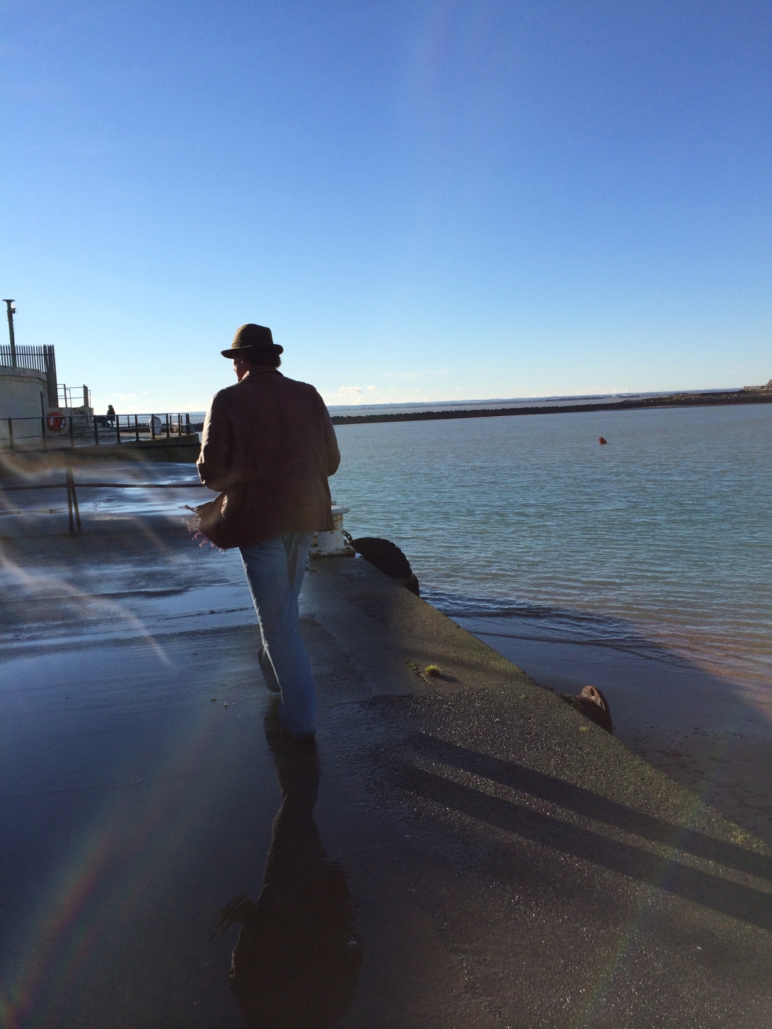
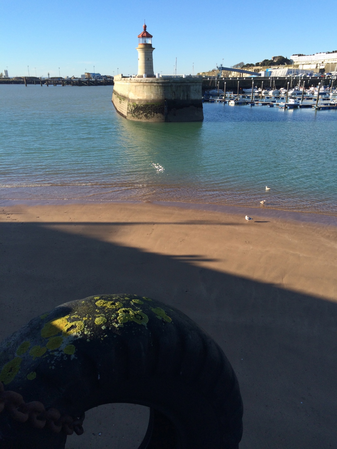
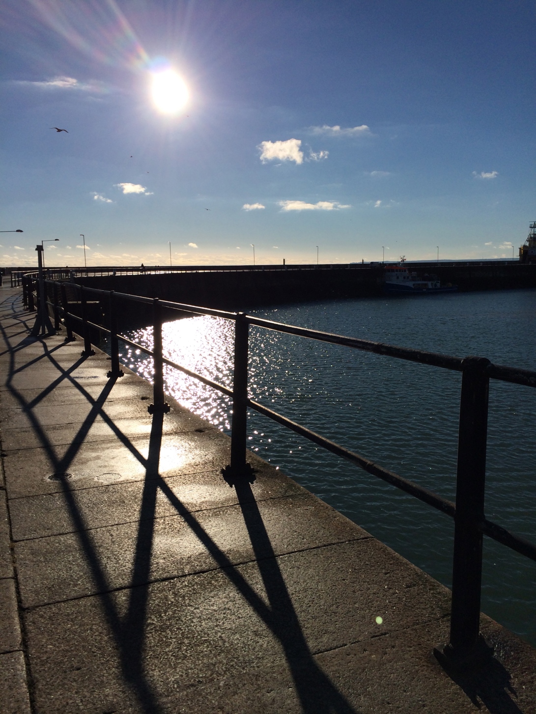
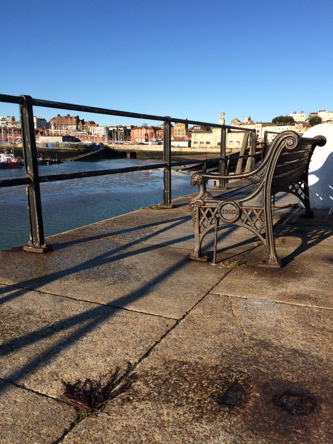
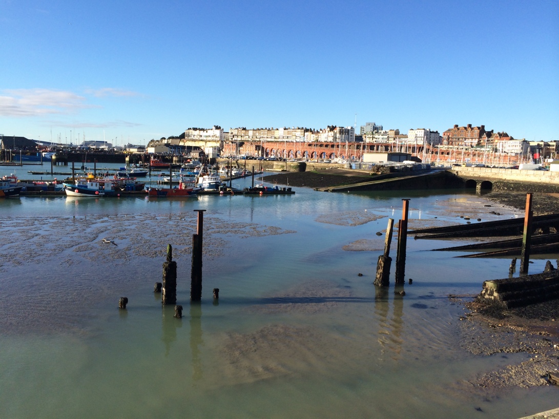
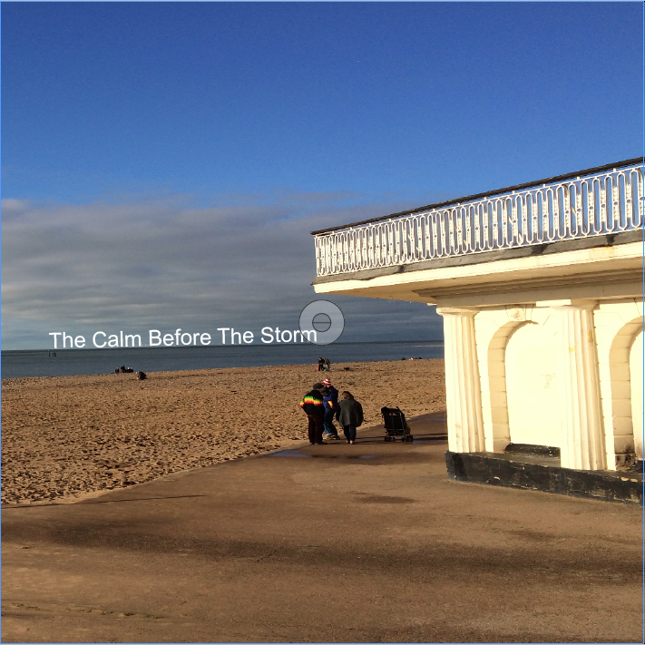
For my double page spread I was going to use the theme “the calm before the storm” as the pictures where taken of ramsgate harbour before the raging storms hit, using a similar logic as the one written above instead of showing the effects of the storm that have been shown in the news etc. I am using photos of the harbour on a sunny winters day.
I particularly like the way they have positioned the text at the top of the buildings. this draws your eye up the building then to the text, I could use the depth in the image in a simiar way.

photo 3

My own version of this.

Picture 15

Editorial Design Concept

For the editorial I need to include a title and 200 – 400 words theses words needs to  be  justification of how I apppoached my photography. I had the idea to title the double page spread “the calm before the storm” I am applying this saying literally to the storms the south east coat recently experienced.

Development #1

Following my comparison of magazines I decided to purchase a copy of British Journal of Photography to look at the spreads inside, the magazine itself appears to focus on budding professional photographers a whole section involves “ones to watch” featuring up and coming photographers, a large majority of the photos are very thought provoking, while I appreciate this style of work I am not sure my photos would fit into this style of art.

Cover of BJP
Cover of BJP
IMG_0491
Photos by Sarker Protick

As I began to read the magazine one page got my attention, the article was about a new app exclusively for iPhone called FLTR the world’s first magazine dedicated to smart phone photography.

IMG_0492

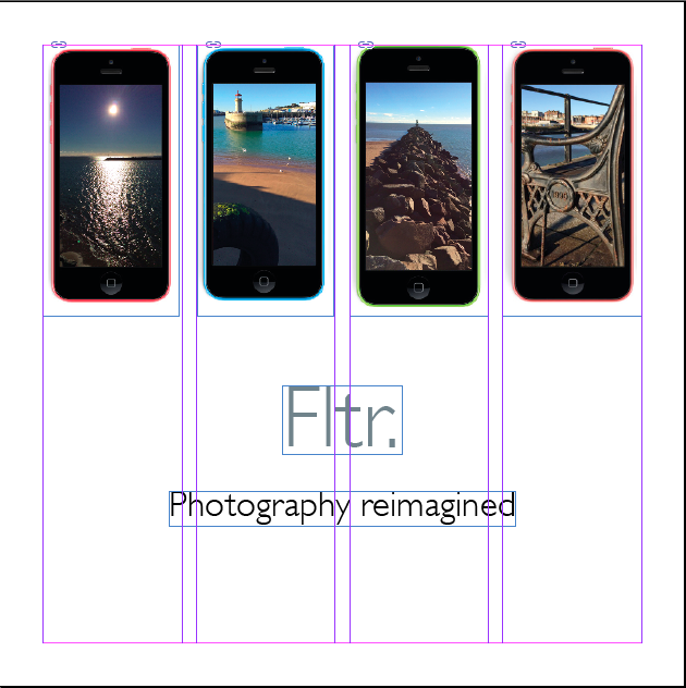
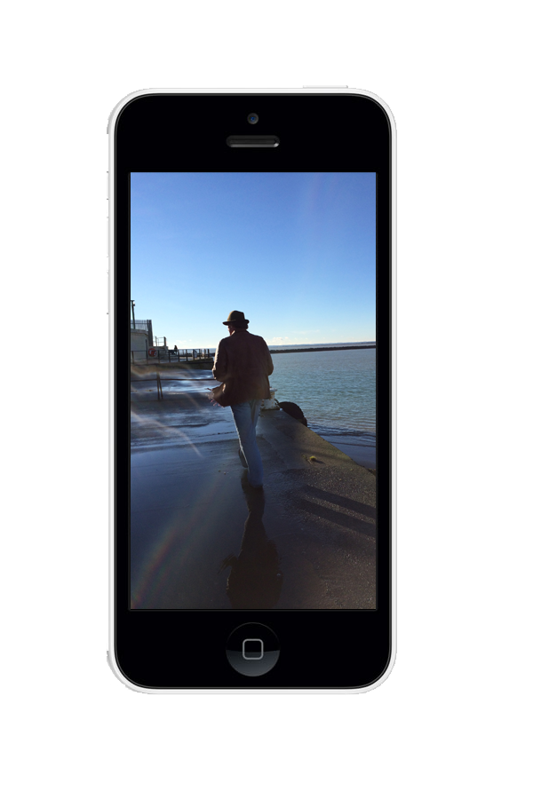
Below is an example of how I could display my photos as thought they have just been taken in an iPhone.Untitled-4My plan is to create an informative editorial giving tips on how to take the best Landscape photography with your iPhone. To help me form content I will use the Fltr article in the British Journal of Photography, the Fltr magazine app and photography books, websites etc.

Development #2

Concept

The story behind the article is to have Fltr team with somebody to write an informative article about landscape photography on the iPhone, I have decided to use Fred Ritchin as the person as he was mentioned in Fltr’s article in BJP he is a professor of photography at New York university, he was credited in the article for writing about the impact smartphones would have had during traumatic events such as the 9/11 attacks on the US.

Body Copy

To form the body copy I used the internet and photography books to put together tip on taking landscape photos with an iPhone.

Here are some links I have used

http://www.idownloadblog.com/2013/10/20/tips-landscape-photography-iphone/

http://www.photographymad.com/pages/view/rule-of-thirds

http://digital-photography-school.com/11-surefire-tips-for-improving-your-landscape-photography

http://www.digitalcameraworld.com/2012/05/16/26-landscape-photography-tips-every-pro-photographer-still-uses/

http://photography.nationalgeographic.co.uk/photography/photo-tips/landscape-photos/

Font

The font I will use is Gill Sans as it is what they use in the Fltr magazine.

Appearance

For the design of the editorial I will take influences from the Fltr magazine app as the article in being created by them, for the styling I wanted it to be a mixture of creative review and British Journal of Photography – fairly clean but with some colour and fun.

Here is a screen shot from the Fltr magazine it was the beginning of an article giving tips in portrait photography.

IMG_0596

I like small details such as the dotted lines seperating the paragraphs in the creative review article below.

IMG_0595

Development #3

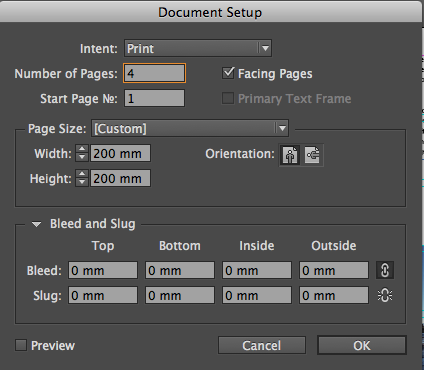
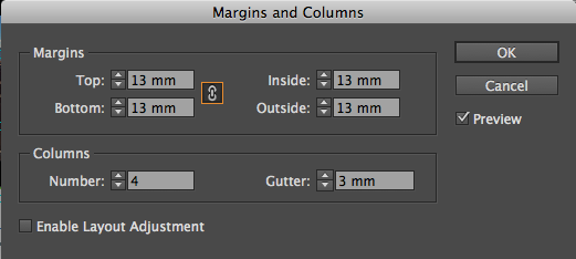
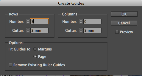
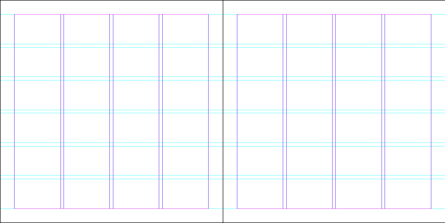
I began by setting up the document to 200mm x 200mm with 4 pages, 4 columns with 3mm gutters, I also added guides, 5 rows with 3mm gutters.

Screen shot 2014-01-24 at 13.24.58
Screen shot 2014-01-24 at 13.26.25

Screen shot 2014-01-24 at 13.27.24

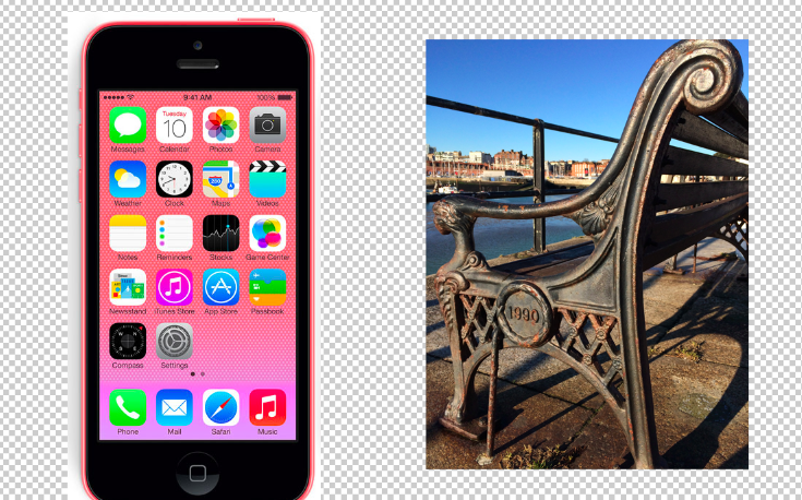
Screen shot 2014-01-24 at 13.28.05In photoshop I placed my own images into iPhones, I did this by clearing the inside of the iPhone and placing my image behind then cropping the edges that where visible.

Screen shot 2014-01-21 at 14.46.42These I placed within the document and began to add text

Screen shot 2014-01-21 at 19.59.40