‘You are to include image and type in any way that you feel is suitable. Each poster must contain at least one ‘unusual’ word and its dictionary definition. Your image and typeface choice should emphasise the meaning or mood of the word.
Please include Octopus Publishing’s logo somewhere on your posters along with the launch date of November 1st 2014.’
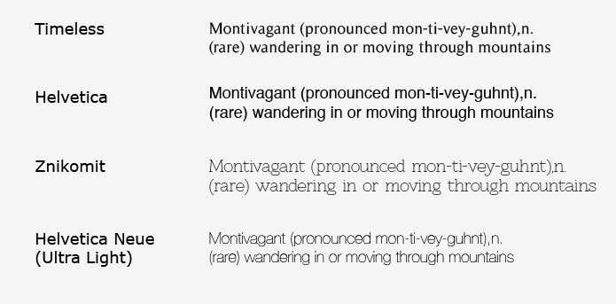
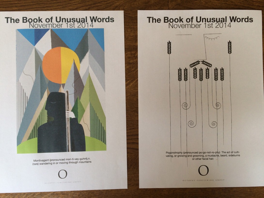
For the type I chose the font helvetica neue, I used Bold for the heading ‘The Book of Unusual Words’, regular for ‘November 1st 2014’ and Light for the words meaning, I first created the type on the montivagant posted then copied it onto pogonotrophy.
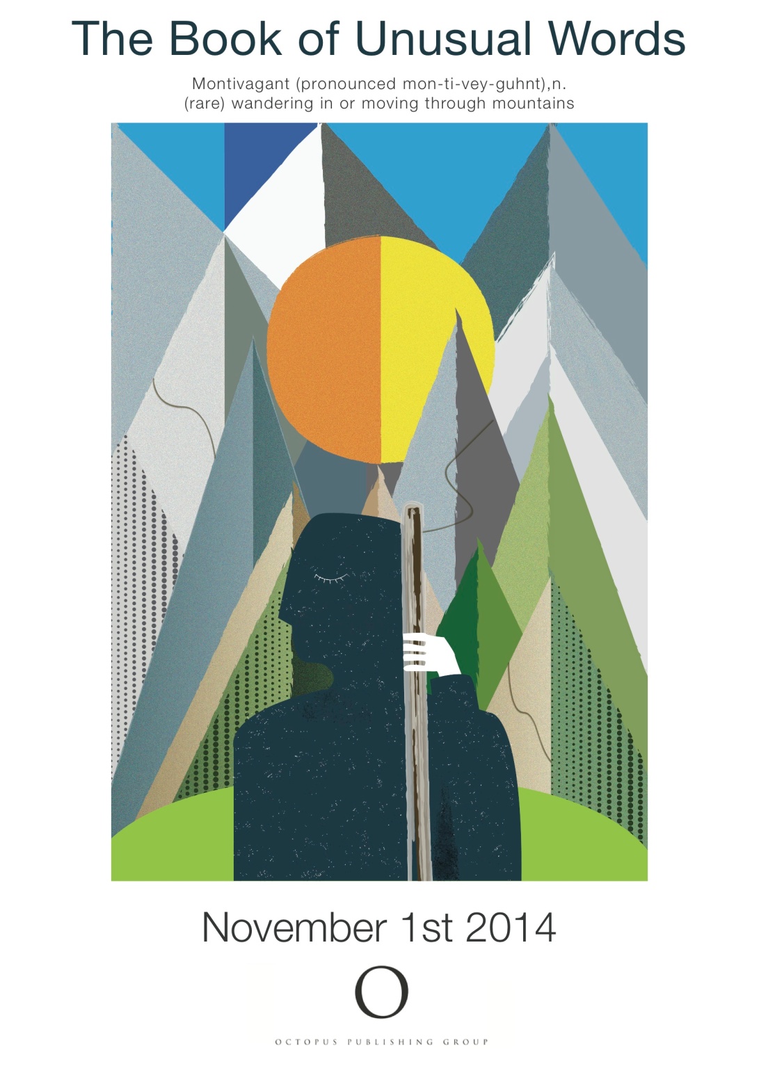
Since these versions I have altered the type after feedback from my tutors.
I kept Helvetica Neue but changed some of the weights, the heading is lighter and the unusual word definition is at the top of the page I have also increased the spacing between words.


