Continuing with the University of East Anglia’s course ‘the Secret Power of Branding’ I research what makes a good / successful brand.
The information originally came from Wolff Olins Blog. http://blog.wolffolins.com/post/44609883279/brand-is-the-effect-of-what-you-do-not-the-cause
Abolish positioning. Think purpose.
Don’t try to manufacture a place in the world. Don’t obsess about the competition and differentiating from them. Instead, as with all good design, start with the question ‘why?’. Why do we exist? Why would anybody need us? Why is what we do useful? Why would people pay (in time or money or whatever) for it? Why is it valuable (in all the senses of that word)? In other words, define a sense of purpose – the difference you want to make, socially and commercially.
Forget identity. Think experience.
Don’t start with name, logo, tagline, sonic identity, or any of these things. Instead, design whole experiences for people – joined-up experiences across all the things you do. Think user interface, in the biggest sense: not the skin around the outside of your organization, but the layer where you interplay with people.
Stop controlling. Think changing.
Don’t try to maintain a status quo, don’t police your brand. Instead, keep experimenting, keep connecting up with new people and new organizations. Let things grow from the roots: revolutions rarely start from the top. Don’t try to pin down the future: prototype it. Replace ownership with sharing, and control with creativity. Look at brands like Airbnb and Zopa, the world’s first peer-to-peer money lending service, to consider how you can connect your customers directly to each other and have them create mutual value. Tomorrow’s high-growth businesses will be constantly experimental and completely boundaryless.
What Makes a good logo?

Why the Pecten?
“The company name was “Shell” and each of Samuel’s tankers carrying kerosene to the Far East was named after a different seashell. The Pecten may have been taken from the family coat of arms of a business associate, Mr Graham, who imported Samuel’s kerosene into India and became a director of The Shell Transport and Trading Company.”
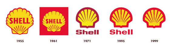
Why Red and Yellow?
“In 1915 the Shell Company of California first built service stations and had to make these stand out from the competition. They used bright colours that would not offend the Californians: because of the state’s strong Spanish connections they chose red and yellow.”
Why I think this is a good logo?

The current logo created in 1971 by Raymond Loewy has become so recognisable that if often appears without the brand name (similar to nikes swoosh or Mc Donald’s golden arches) this gives the logo more potential when being used as it is flexible. The Bold colours and lack of text mean it is easily spotted when driving at fast speeds!


