Design Factory Exploration

Paul Smith and british boot maker John Lobb collaborated on three special edition shoes.

Where is the identity in this object?

John Lobb is a well know british boot maker and the classic oxford shoes created by him have been worn in britain for over 100 years, I like the outcome of the collaboration because the oxford shoes are associated suits, work and high classes of people, by collaboration with Paul Smith the shoes that where once fairly boring now have a coloured inside which adds subtle quirkiness to the shoes.

IMG_0046

I would love to have this teapot in my kitchen! it was designed by Paul Smith for Thomas Goode and is sold in store for  £360. Thomas Goode is recognised as the best bone china producer in the world.

The stripes are achieved on the fine bone china by a way of slide lithographing, which is fired and fuses to the surface of the wares. The finer details are then expertly hand painted and glazed. The gold used on the detailing is a liquid gold leaf (28%), equivalent of 22 carat gold.

The teapot is definitely an iconic british symbol, the rest of the world  stereotype that drinking tea is part of british culture.

I like that Paul Smith has redesigned something very traditional to british lifestyle.

IMG_0042

Much like the Thomas Goode Teapot Paul Smith has used his iconic stripes on a Mini Cooper.

The 1997 Paul Smith Mini will be the latest addition to our showroom as of 7th July until early September.

This 86 stripe, 26 colour design is charecteristic of Paul Smith’s 1997 collection with the original project being prompted by his use of a Mini as a motif on a women’s skirt. The final paintwork represented the essence of his style exactly and this became one of three designer mini’s by Paul Smith.

The car was unveiled at the Tokyo Motor Show in 1997 with only 2 verisons being produced.

Techinical Stuff

Engine Four cylinder in-line engine
Displace 1275 cc
Power o 46 kW/63 bhp at 5700 rpm
Transmi Four-speed manual gearbox
Dime 3100 x 1440 x 1351 mm
Unladen weight 770kg
Maximum speed 148 km/h (92 mph)
Bore x Stroke 70.6 x 81.3 mm
Front brakes Hydraulic disc brakes
Rear brakes Hydraulic drum brakes

IMG_0017

These lanyards where created by paul smith for his fashion shows, if it fits the brief I could use Lanyards to display britishness for the Design Factory Competition. I like that in something so small you can say many things, they are in expensive and object many people collect and keep.

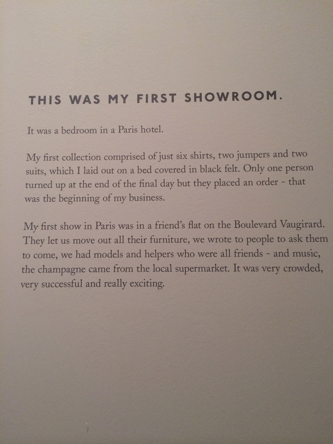
IMG_0030This was Paul Smith’s first show room in a Paris hotel, it is made from card board and paints this gives the effect of a sketch on paper as though the memory of his first show room has been sketched.

IMG_0021

IMG_0025

This drawing was amongst Paul Smiths collection of artwork, the fact that the black and white zebra is asking “is that a Paul Smith coat?’ shows the identity in his iconic stripes, regardless of what object they are painted on they can always be associated back to him.

I could use this idea for my Design Factory piece by using an object completely un related to Britain and altering its appearance so people associate it with Britain.

IMG_0089

Visual Communication

I looked back to a lesson we had on visual communication, in this we learnt what would aid us or prevent us from communicating succesfully.

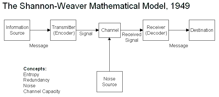
We looked at Shannon & Weavers model of communication.

Shannon-Weaver Model

Shannon and Weaver argued that there where three levels of problems in  communication

  • A The technical problem: how accurately can the message be transmitted?

This could be a printer not working, distractions, wrong size and commonly design noise – a more eye catching design which takes the eye away from yours, this could be a problem in a magazine if an article is sandwhiched between more eyecatching peices it may only be glanced at as the others would be taking the main bulk of attention.

Unless as a designer you where in charge of the whole magazine this could be difficult to combat, you can however make yours as eyecatching as possible.

  • B The semantic problem: how precisely is the meaning ‘conveyed’?

This the designer has control of, if research is done properly and the piece is in the right place at the right time in front of the right audience, The rest is what the designer has created and how well the audience understands this.

  • C The effectiveness problem: how effectively does the received meaning affect behaviour?

This is the outcome of the peice. eg does and advertisement increase sales of the product, if so then it has been visually communicated succesfully.

Before & during creating any peice I will refer back to the three points, I will begin by choosing my audience and making sure the peice is directed towards them.

Form & Counter form

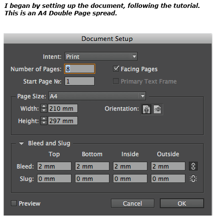
We begun by creating a poster using simple form and Counter form techniques (black and white space) using Adobe Illustrator

Begin by drawing a rectangle leaving a margin around the edges.

1

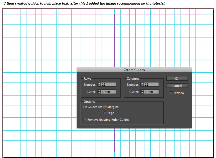
Then Split into grid for this I used 6 x 6

23I used Gil Sans 250 pt to type large letters

4Select all the letters and Send them to the Back

5Move a letter over the first box, select both and create a clipping mask.

7It should look like this

10You can move the letter freely using the Direct Selection Tool.

9

Repeat the previous steps

1112

Some Variations

Screen shot 2013-10-09 at 12.35.53 Screen shot 2013-10-09 at 12.37.08

Screen shot 2013-10-09 at 12.20.47 Screen shot 2013-10-09 at 12.42.05 Screen shot 2013-10-09 at 12.48.34

V&A Trip – Memory Palace

In what ways do you feel that the “walk through book” ideas work effectively or not?

At a glance the memory palace seemed a mixture of text, illustrations and sculptures. It appeared to have no structure filled with works of 20 different artists who approached in different ways. I returned to the beginning and viewed each the exhibit piece by piece in order, some were easy to understand such as the acrylic print by Nemo Tral which meaning was clear and enforced by the usage of olympic structures that were ruined by a magnetic storm. However as I progressed though the exhibit the meanings appeared to be more vaugue entering the mind of the prisoner – trying to remember the past. As a whole the memory palace was impressive and I enjoyed finding the store behind the pieces of art.

Choose two pieces from the exhibition and make a detailed analysis of them

The first piece was close to the beginning of the memory palace, Nemo Tral has used     acrylic print in front of a UV light box, this is composed over three various sized rectangle canvases, the picture is created with black paint this contrasts against the light showing through, it has a sepia colour scheme.

Nemo Tral
Nemo Tral

There are various narrative passages from the book it self, such as:

“Yes, theres something larger than me; I live in its ruins”

As these are read you are put in the characters shoes, alongside the artwork this creates a powerful image, as you see what the person in the book sees.

It fits in at the start of the Memory Palace book by showing the worlds information infrastructure wiped out by an immense magnetic storm, Nemo Tral has used the city of London to portray this part of the book. Certain buildings that we could never imagine in this way have been used, such as the Olympic Orbit tower, the Olympic Stadium and skyline views of london. These iconic buildings create a powerful image especially to residents of London. This does not remind me of anything particular except that the sepia colour scheme enhances the post apocalyptic scene and looks as though it was an image of the past.

The second piece was difficult to choose, settling with one dramatically different from the others which was by Peter Bil’ak, it uses purely type to show an extract from the memory palace book, which at a glance could seem lazy as the words are already written, however after reading those words, (which at first i believed to be paper but after the exhibition realised they where made from steel) my own views started to develop.

The extract begins with “When they took me back to my cell” this appeared to be a reason why Peter used steel to make the letters as metal would be like the bars of a cell. The next line “I lay on the floor, watching the jewels in my memory palace spin and turn, gorgeous and bright” this line for me made a visual connection with the piece, as the lights in the gallery shone onto the letters shadows where created in many directions, to me this was like light shining through a crystal but bouncing of in a different direction as the passage says. I liked this piece as never before has something so simple sparked so many ideas in my mind.

Why did he do it this way? Below is a link to a video explaining the piece.

http://vimeo.com/68532889#embed

List some ways in which you could be inspired by these exhibits, or the exhibition as a whole

The piece by Peter Bil’ak inspired me as I am used to thinking more parts equals more interestings, however this piece showed me that something a common as type can be adapted to an interesting work of art.

The exhibition as a whole has given me many ideas which I hope to use in the future.