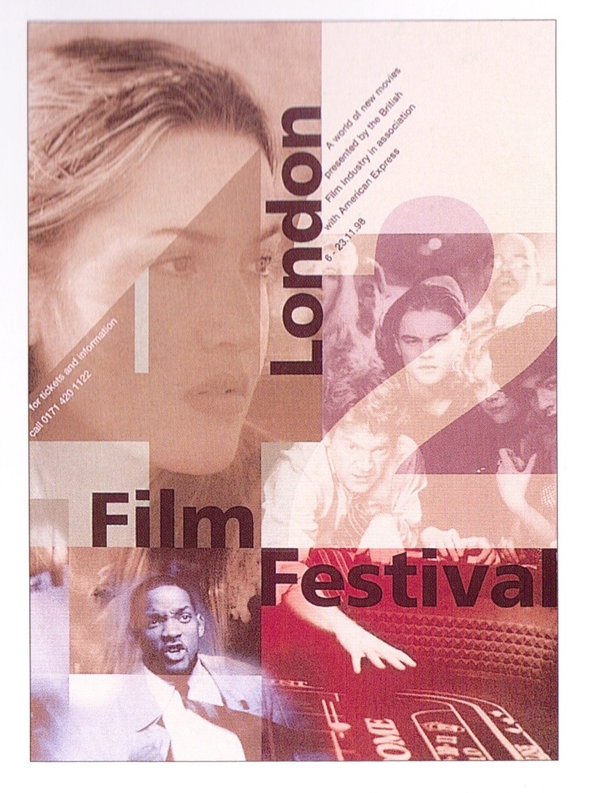
Based on this Poster by David Carson, I Decided to transform the type on my poster to something more interesting. The first aspect that drew my eye to this poster was the use of different fonts. I believe there are only two. One used for ‘David Carson’ and another for the rest of the type. The use of two different fonts draws the viewer’s eye towards one in particular in this case is ‘David Carson’.
Although there are only two fonts the designer has mutilated the ‘Carson’ dicing the letters up, this is common for David Carson – he in known for being experimental with type, he has used the other font in different size, colour, reflected and rotated. By doing that it adds colour and more elements to the poster – it wouldn’t be as interesting without those changes.
He has also deliberately spelt the word Typography ‘Typografe’ giving a rebel attitude to the poster, I won’t use that in my poster however it works well advertising something by David Carson, again he is breaking the traditional mold for any poster (typing errors)
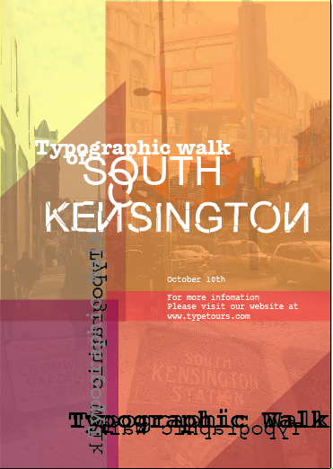
I prefer this version of the poster compared with the previous, it now has added elements which add texture and draws the eye to key parts.
I decided to use ‘South Kensington’ as the main type as although the poster advertises a typographic walk, South Kensington is an iconic and affluent part of london and people associate it with learning, culture and arts, therefore I believe a poster advertising the words ‘South Kensington’ would be of interest to my target audience drawing them in.
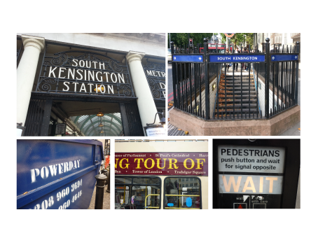
By using type as the key element of the poster and be keeping the images to the background layers, suits poster well, type is the focus of the walk not buses or buildings however by using the images it adds interest, some of the images I have used are of type in South Kensington, this will give people an idea of what they will see during the tour without being too obvious.
The word Kensington.
This is an important element for me to write about. I took the idea from the David Carson poster, but it works well in not only adding a different style but also creating an urban edgy look as the tour is set in an urban area but compliments the tour.
The font I have used for the rest of the type is Courier, I do not know whether it was used in the David Carson Poster however it is very similar, I like this font as it is like that of a typewriter therefore being iconic and something people are familiar with even if they do not make a direct connection, it is simple and easy to read.
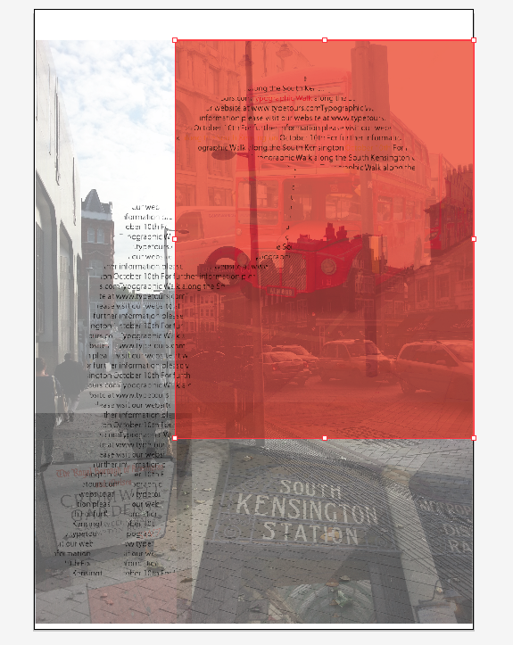
I have not used a grid to place the type which probably goes against many graphic design rules however this is how I wanted to be, quite relaxed. Instead I have used the places where the boxes overlap as ‘guides’, and my own eye to judge the positioning of type.
My only concern now is the colour scheme, it looks quite feminine. The poster is aimed at all genders, so I may change the colour slightly to adopt that.
Summary.
Pros – I am happy with the Type
Cons – Colour Scheme