Typographic Postcards – Brief

‘You are to design TWO A5 postcards to promote the History of Type conference at St Bride.’

One of your postcards will be of a specific typeface. You will be allocated this. The aim of this postcard is to visually describe and highlight the characteristics, unique qualities and key aspects of the typeface. The reverse of this postcard should include a blurb of no more than 50 words that explains who designed this typeface, what was their reason for doing so and what special purposes this typeface fulfils (if you can find these things out).

The second postcard should describe in an interesting manner any aspect of the history of typography. This aspect is of you choice and can be very specific or more general. You may use found images but must credit/reference these on the reverse of the card. Also on the reverse of the card you must include a blurb of no more than 50 words describing why the aspect of type history that you have chosen is significant and important in the development of type.

Both cards must also include on the reverse the following text:

The History of Type Conference at St Bride Library

1st-3rd December 2013

www.stbridelibrary.com

Please note that this is a very short project and you must submit two fully finished postcards.


Picture 15

Postcards – Research

I begun by researching postcards, I found a few in my house.

Scan 1
Front
Scan
Back

This postcard advertising Andrew Lloyd Webbers Wizard of Oz is very colourful and eye catching, it is aimed at families with children, the design is eye-catching and advertises the price and where you can purchase tickets on the back, it also acts a a memento people would keep after watching the show with one of the main characters featured on the front.

While this is an effective postcard the The Wizard of Oz, there are not any features that I believe would work well in my Postcards.

Picture 17

Scan 2
Monet’s Gardens at Giverny – Front
Back
Back

I think this postcard is beautiful and one that many people would keep rather than send, it’s more a photograph you would take yourself and the layout on the back does not urge you to write on it as there are no guidlines or stamp boxes, purely a description of the Garden and the photographers name.

I am going to base the back of my postcard on this one as I hope people will look at it and think thats a nice bit of design and keep it.

Picture 15

History of Type Research

I begun by researching the history of type, my main focus of research is the history of communication, from cave man drawings to the earliest letter forms.

I used this website here to begin my timeline.

http://www.citrinitas.com/history_of_viscom/index.html

Cave Paintings

The oldest known forms of  communication where cave paintings dating back to the Upper Paleolithic (basically the stone age) these of course do not contain writing, rather pictures these often tell a story and contained huge amounts of information from that era.

The Oldest know cave painting is from the Chauvet Cave in Southern France

http://blog.francedc.org/chauvet-in-ardeche-is-proposed-to-become-a-unesco-heritage-site/

Petroglyphs

Petroglyphs are carvings into a rock surface, these came around 20,000 years after cave paintings, these where still used in tribal societies until the 20th century before they became westernised. The main reason for this is that carvings often hold a cultural or religious meaning, these meanings can be passed through out  generations without being marred.

http://en.wikipedia.org/wiki/File:Libya_5321_Meercatze_%28Gatti_Mammoni%29_Petroglyphs_Wadi_Methkandoush_Luca_Galuzzi_2007.jpg

Geoglyphs

Geoglyphs are drawings in the ground, where the image can only be made out from a birds eyes view, the reason for this is unclear however most believe it was for religious reasons so that only the Gods could see them.

Some of the most famous geoglyphs are the Nazca Lines these are gigantic geoglyphs found in the Nazca Desert in Peru, they where created between 200BC and 600AD.

OLYMPUS DIGITAL CAMERA

Times New Roman – History

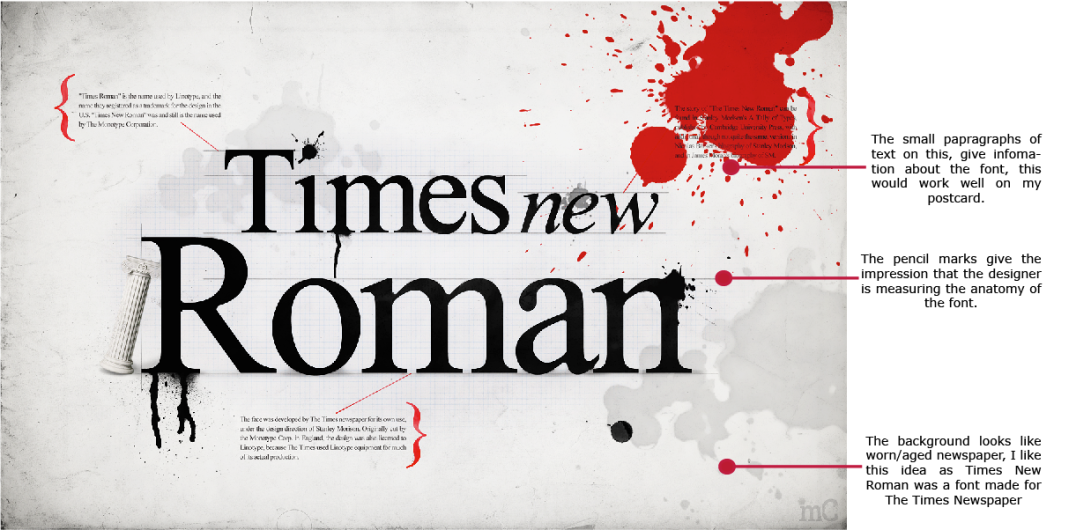
The Font Time New Roman gets it name from The Times newspaper of London, commissioned in 1931 after Stanley Morison a British Typographer cristicised the newspaper for poor quality printing. He was commissioned to create a new easy to read type face he developed this with Victor Lardent and was first used by the newspaper in 1932.

20131106_110547
An Extract from The Encyclopedia of Type Face by Jaspert, Berry & Johnson

Times New Roman is no longer used by The Times news paper however it was adopted by Microsoft as the default font. It is frequently used in book typography particularly in paper backs in the US becoming one of the most used fonts.

Picture 15

Back to Basics

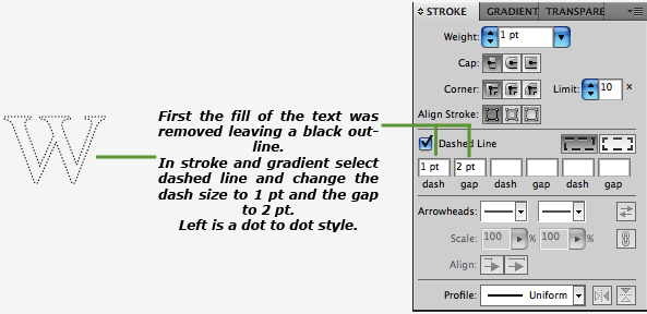
Many people look at font and just read the words it is saying, most people do not look at the anatomy of the font unless they have studied it, this made me think of when I was learning to write as a child and i used dot to dots to help me form letters.

I  had an idea to use a dot to dot times new roman on the postcard, and then a phrase beneath saying something like:

Dot to Times New Roman

Learn to Font

Discover Font

Discover who joined the dots

These may seem a bit cheesy but postcards usually are! And I can imagine a designer finding this a comical postcard to send to a fellow designer, but also it wouldn’t scare someone new to type away from the conference.

Handwriting Template
Dot to Dot Words

Picture 15